This is a series of posts about the making of my marketing video for Fin. You can see the other parts of the series by following the links below:
1 | 2 | 3 | 4 | 5 | 6 | 7 | 8 | 9 | 10
This is part seven in a series about the making of a product marketing video for my app, Fin. The hope is that I can inspire others to try and make these kinds of videos for their own products, as I think they are pretty essential for selling apps to customers.
Putting together Each Shot
Now you have all your footage, you have your device images, and you have your text shots in place. The next step is compositing your device shots in Final Cut Pro X to fill in the holes.
Start by placing the device you want into the timeline. Resize the image it so it takes over most of the screen. Next, on a layer above, place in your screen grab clip. If you cropped it correctly, it should be in the proper aspect ratio to cover the screen on your device perfectly. Resize the screen grab clip until it fits into the screen area, remembering to leave a bit of black “space” around the edge of the screen. Use your own iPhone or iPad as a reference for how the screen should be placed. If you’re very careful, the screen grab clip will look like it belongs with the device. Especially as we get to the next step, which is animating the camera.

Final Cut Pro X has this nifty feature called Compound Clips, which allows you to take two layers of your video and combine them, so that you only need to manipulate the grouped object, rather than its parts individually. Since we’re going to be performing some acrobatics with our iPhones and their screens, it’s important that we create compound clips of the device with the screen footage, so that we don’t have to try and animate each piece of the shot individually in perfect sync. The last thing you want is for your screen to look like it’s not attached to the device as they both move.
Select the two layers (screen grab and device image) and right click to create a compound clip. Once that’s done, your two layers are now linked together perfectly, so any animations can be performed on the compound clip instead of the individual elements. You’ll repeat this for each shot, making a new compound clip for each.

Now comes the fun part: Animating the shots. You could just leave your devices sitting there perfectly still as the screen animates your app to life, but one of the ways to make the entire video have just a little bit more polish is to have the camera move in various ways during the individual clips. The movement of the camera should be slow and not too extreme, of course. We don’t want to distract from what’s happening on screen. But with the right amounts of pan and/or rotation, your video can really come to life with little effort on your part.
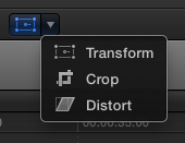
To animate each clip, we’re going to be using the transform controls, which are available on the bottom left of the preview window of the Final Cut Pro X interface.

Move your playhead to the first frame of your compound clip and create a keyframe by clicking on the red diamond icon on the top left of the preview window.

That establishes where the animation will start. (If you want the device to start somewhere slightly off screen, as if zoomed in, move it and zoom it into the place you want as a starting point.) Next, move the playhead to the last frame in the compound clip, and create another keyframe. Then scale, pan, and/or rotate to the final position you want.
Basically, you’re telling Final Cut where you want the positioning, scale, and rotation of the video to start, and then where you want it to end. Final Cut will figure out how to go from one to the other.
I recommend doing only one camera move per clip, and to not make the transformations too extreme. If the device is flying through the air too fast or rotating to a large degree, you’ll end up distracting from what’s happening on the screen. The key here is subtle movement, and to vary the movements from clip to clip. Zoom in sometimes, zoom out others. Rotate slightly left, then right. And so on. Also, don’t zoom too far in either direction, as making the shot too large will cause scaling issues (your original footage has only so much resolution to work with, after all) and zooming out too far will make the screen hard to read. If possible, use zooming and panning to highlight the portion of the screen where the most important action is taking place.
After animating each clip, you can put in some nice cross dissolve transitions if you like, or leave each clip as a hard cut. It’s a stylistic choice. I’d avoid using the more fancy transitions, as those are more appropriate for birthday party footage of the kids. Most pro videos, if you watch closely, use dissolves, or nothing at all.
In the next part of the series, we’ll take a look at animating the hand gestures, and adjusting your clips for better timing.