As I continually iterate on the Mixologist Sticker Pack, I’m also paying close attention to the iMessage App Store and its trends. Screenshots for sticker packs are still largely disappointing. But some of the craftier developers are coming up with presentations for their stickers that are quite nice.
My favorites have done away with the entire notion of presenting actual screenshots, and are instead just presenting the stickers in rows on a colored background. This makes perfect sense, as anyone buying stickers gets the idea, generally, of what stickers can do. What a buyer wants to know is what the stickers look like, more or less. And that’s it.
I ended up taking this approach for the latest version of Mixologist and the Leo Collection, and I think the results are quite good.
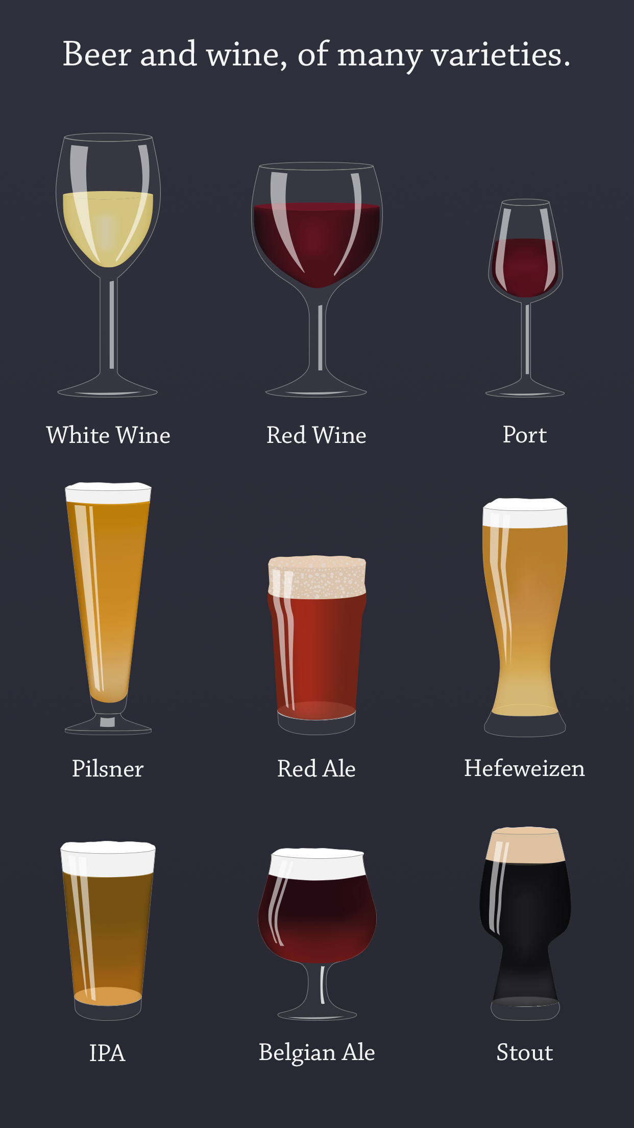
There’s just no way to make a shot of an iMessage conversation look particularly eye-catching. By simply showing the stickers in rows, I’m both presenting my stickers in the best light, and giving my potential customers a better sense of what they are buying.
You can see the full set of five screenshots on the App Store.