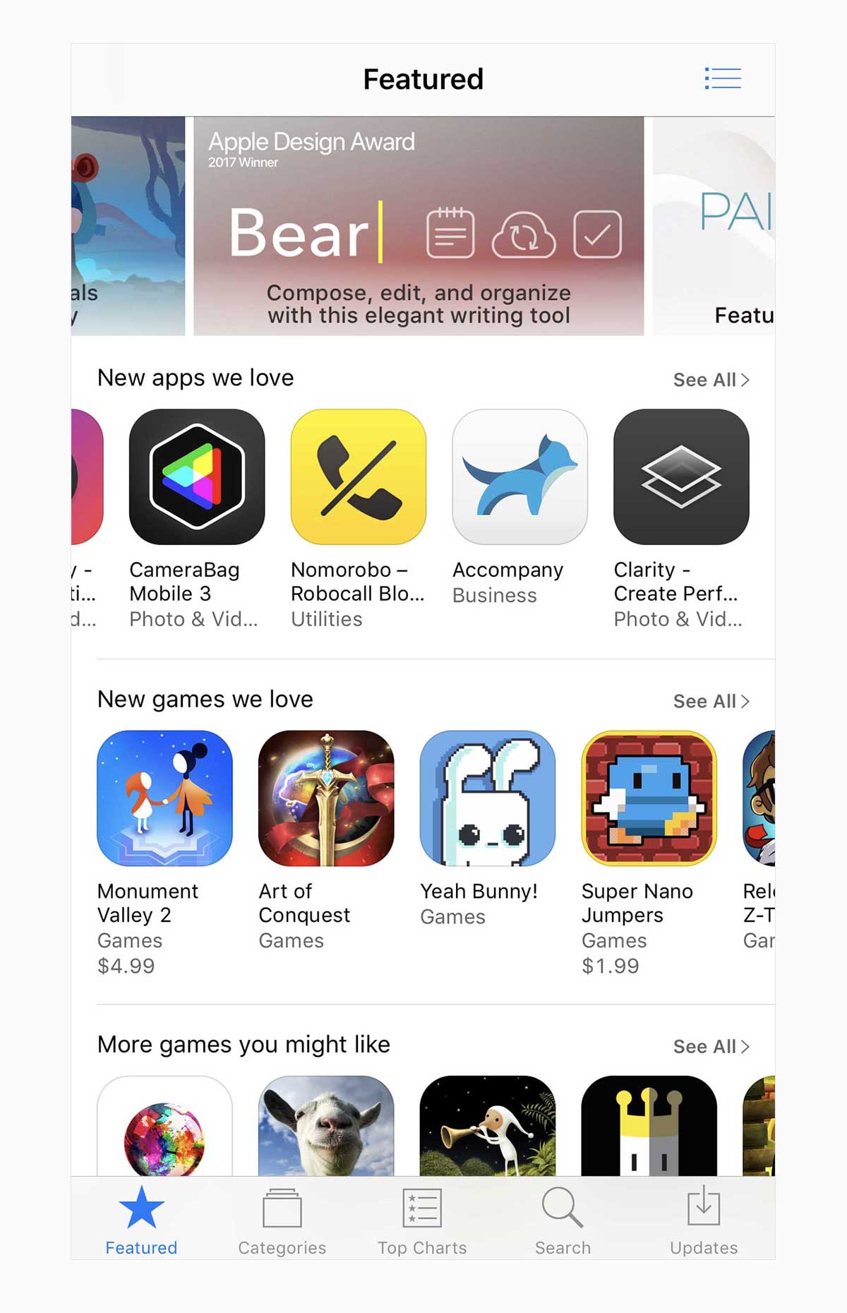
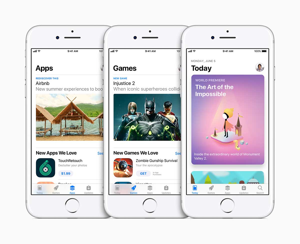
I’ve heard rumblings from some in the iOS community about the new App Store design regarding density of information. “There are fewer things on screen, so there’s less being featured” is the gist of the argument.
Uh, no.
By definition, to feature something is to make it stand out. The more items you “feature” on a screen at once, the less effective any one of those features will be.
There may be fewer featured items on any particular screen, but these larger featured items are far more likely to grab the customer’s attention, in other words.
Looking at the current App Store now, especially on iPhone, I’m not surprised at all that “being featured” isn’t bringing in the downloads as effectively as it used to. It’s very easy to get lost on any screen in that sea of icons and small banners.

My impression of the new App Store at first glance was “Finally. This looks like an Apple Store, not a bargain basement.”

Others have compared the layout to a nice high-end magazine, which makes sense, given the design language borrowed from the News app. The point is, the new App Store is clean, beautiful, and focused. And just like the Apple Stores, it invites people to come and hang out, not just run in when they need to buy something. It’s somewhere you want to visit. To learn. To engage. And then maybe to shop.
This is a good thing.
Apple learned a great deal while becoming the world’s most successful retailer. And that knowledge has finally made its way to this new digital storefront.
And about that “featuring fewer things” argument: It ignores another important fact about this new App Store.
If it’s not obvious from the title of the first tab, the store will for the first time now be getting updated, at least in part, daily. That’s a big change from the weekly update schedule Apple has maintained since the beginning of the App Store. You can’t name something “Today” and then not update it every day. So instead of a few new items getting featured once a week, something new will be featured every single day. There are also different categories of features, including profiles with developers, tutorials, curated collections, behind the scenes looks, and more. Apple also says it will be refreshing content all over the store every few days. This is going to take a tremendous amount of work to maintain, and Apple has staffed up in order to maintain it. That’s big news.
Apple has been known from time to time to put one or two people on important projects and expect too much from them. From what I’ve heard from little birdies around WWDC this week, App Store Editorial is getting resourced appropriately for this new increase in curated content. They are committed to it.
What this means is that there will be many more features than ever before, not fewer. And people will have more incentive to visit daily and take a look at each feature.
And it’s worth noting that you don’t necessarily need to be a giant company with insider access to get featured (though I’m sure that doesn’t hurt). Visit appstore.com/promote and tell Apple your story. Impress the editorial staff, and you have a decent shot at getting into one of these features.
Time to hone those sales pitch skills, indies.
Currently, App Store is an app you only use when you already want to buy something, not a destination unto itself. This new design aims to change that. Only time will tell if it works, but I think Monika Gromek and her team have done a tremendous job with it. I’m sure they will adjust and refine the design over time as it gets out into the wild.
The more people there are hanging out in the App Store to read about featured content, the more likely they will eventually buy something. That’s retail 101. If you give people a reason to visit daily, you will increase sales organically.
I have a lot more to say about the App Store redesign, and I’ll be talking about it more in the coming weeks, both here and on the podcast. If you have apps on the App Store, go watch every WWDC video related to App Store, iTunesConnect, and StoreKit. I know all that Machine Learning and AR stuff is tempting, but your slick new app won’t be going anywhere if you don’t present it effectively in this new store.