all micro contact rss

Anatomy of a Product Video Part 10

This is a series of posts about the making of my marketing video for Fin. You can see the other parts of the series by following the links below:

1 | 2 | 3 | 4 | 5 | 6 | 7 | 8 | 9 | 10

This is part ten, the final in a series detailing the process of making a product marketing video for my app, Fin. I hope to inspire others to try and make these kinds of videos for their own products, as I think they are pretty essential for selling apps to customers. We may not all have the budget to hire a pro team to make super-awesome videos for us, but we can make something worthwhile if we put in some time and effort, and a little bit of cash.

The Intro Animations

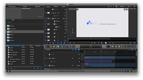
Now comes the part where I used the app Motion to create some cool animations on my logo. For the introduction of the video, I wanted to show my logo and tagline, of course. But I wanted to come up with a nice way to have them animate onto the screen.

I won’t go into all the details of how Motion works (there are tons of great tutorials online) but suffice to say that what I used it for on this video was a tiny sliver of what this program can do. Multiple layers of text, imagery, and video can be combined with 2D and 3D camera effects to produce great results. And it’s a fairly easy app to get to know, if you’ve used any sort of keyframe animation app before.

You could accomplish your intro quite easily using only Final Cut Pro, with a nice fade in and some camera panning, just like we did with the other video clips. But Motion is one of those apps you should have in your arsenal for putting some nice pizazz into your animations. Spend an afternoon with it, and you’ll have a blast. The more I get to know how the app works, the more tempted I am to overdo it with crazy animation. So be careful about that, too.

Upload Time

Hopefully by now you have a great video that shows off your product in an incredibly positive light. The last thing you want to do is screw up all that hard work by presenting the video poorly on your own web site.

You basically have two choices for how to host your product video. You can host it yourself on your own server, or you can use a service like YouTube or Vimeo.

The upside of hosting yourself is that you get full control over the entire presentation. The downside is that you have to pay for bandwidth yourself, and you lose the tracking/social features that come with video services. If the video is only going to be watched by a few dozen people, bandwidth won’t be an issue. (Hopefully, you have higher aspirations for the size of your audience than that.) If your video were to go viral, you could end up with a pretty big bill at the end of the month.

Personally, I recommend Vimeo for hosting videos. And I also recommend getting yourself a “plus” account on Vimeo as well. With the plus account, you get all sorts of nice features, but the one that appeals to me most is having a lot more control over how the video gets embedded on my site. I can turn off all the extra distractions on the video interface, control the poster frame, and choose what shows when the video ends. It’s a nice feature set that costs relatively little and goes a long way to making the videos on your site look more professional.

As a bonus, Final Cut Pro X can export your video directly to Vimeo, and it’ll handle all the maximized compression settings for you.

Remember, your product videos are commercials for your products. They shouldn’t be cheapened by ads for other people’s products. With a little bit of clever Javascript, you can make your video look very clean and well-integrated into your site, while still getting all the benefits of having your video available on Vimeo’s network, with all the tracking and social features that provides.

In Conclusion

So that’s how I made the product video for Fin. It was a great time, and in the end I think it turned out pretty nice. I’m still always improving my skills with video editing, and I think my next video will be even better. Sure, if I had hired a pro team, I could have made a video that really knocked people’s socks off. But I think this video is way better than not having anything at all, and it only took me a day. (Plus, it was a great switch from programming and designing to stretch my creativity in this way.)

I ended up writing a lot more about this topic than I had originally planned. Hopefully, people will find it helpful for making their own marketing videos. Most importantly, you shouldn’t be afraid to try and make videos yourself, or to try and put something together with friends on a budget. As long as you can make something that’s clear and well-thought out, you’ll go a long way to helping impress your prospective customers. And that can only help raise people’s impression of your company.

1 | 2 | 3 | 4 | 5 | 6 | 7 | 8 | 9 | 10

Anatomy of a Product Video Part 9

This is a series of posts about the making of my marketing video for Fin. You can see the other parts of the series by following the links below:

1 | 2 | 3 | 4 | 5 | 6 | 7 | 8 | 9 | 10

This is part nine in a series detailing the process of making a product marketing video for my app, Fin. I want to inspire others to try and make these kinds of videos for their own products, as I think they are pretty essential for selling apps to customers.

Music

I’ve been a musician longer than I’ve been a designer, so I like to create my own music for product videos. The biggest advantage here, other than the fact that it’s a fun excuse to spend a few hours in Logic, is that I don’t have to worry about licensing fees for the music I make myself.

Assuming you’re not a musician, or you don’t like to compose your own music, you’ll want to look into some alternatives for your video. There are lots of license-free music clips you can use floating around, although you’ll want to be careful not to pick something that’s already been used too much. As I mentioned earlier in this series, Garageband and Logic both come with a number of musical jingles that can be used, or you can mix up something with the free provided loops in those packages. Or perhaps you know a friend in a band who wouldn’t mind letting you use some of his or her music in exchange for a credit.

If there are no free alternatives at your disposal, there are songs that can be licensed for a reasonable fee as well. Search around the Internet and you’ll find them. This is a cost you’ll have to pay regardless of whether you hire a pro crew to do your video or not.

The goal with your music, as with so much of the video process, is to be appropriate and not too distracting. Try and find something that matches your product and that isn’t too far into one genre that it might turn off a portion of your audience.[1]

You can’t make everyone happy with your musical choice, but at the same time, you shouldn’t go out of your way to alienate a large portion of your audience, either. It’s a tough decision.

Once you’ve chosen your track, you need to pop it into your video timeline and see how it runs with the visuals. You’ll be surprised at how much extra tweaking you’ll want to do to your edits to make sure they flow with the beat. Have those cuts from one shot to the next happen on downbeats whenever possible.

For Fin, I had an additional consideration. Fin is a timer app, and as such, whenever the app is shown, it’s counting down (or up) in seconds. So I needed my musical beat to match this clock ticking. Fortunately, I was writing my own music, so all I needed to do was use a tempo that matched actual seconds. 60 bpm (beats per minute) provided the perfect rhythm[2]. I still had to make sure each shot started on the downbeat with my second counting, of course. But it really helped tie my video in with the music nicely to have that pulse as a guide.

In the final part of this series, we’ll wrap things up with some animations for our logo at the beginning of the video, and talk about options for hosting your video.

1 | 2 | 3 | 4 | 5 | 6 | 7 | 8 | 9 | 10

  1. I love Rush and Yes way more than the average person, but I’m not going to use prog rock in my marketing materials, unless there’s a good reason for it. At the same time, though, I’d avoid the trendy hipster banjo-type music that’s been getting way overused lately. (That stuff makes me glad I usually watch product videos on mute.)  ↩
  2. It would have been stupid to set my tempo to an odd tempo that knocked my seconds out of sync with my drum loop, like say 63 bpm, or 75bpm.  ↩

Anatomy of a Product Video Part 8

This is a series of posts about the making of my marketing video for Fin. You can see the other parts of the series by following the links below:

1 | 2 | 3 | 4 | 5 | 6 | 7 | 8 | 9 | 10

This is part eight of a series detailing the process I used to make a product marketing video for my app, Fin. I hope I can inspire others to try and make these kinds of videos for their own products, as I think they are pretty essential for selling apps to customers. We may not all have the budget to hire a pro team to make super-awesome videos for us, but we can make something worthwhile if we put in some time and effort.

Slight of Hand

As I mentioned earlier, there was one extra challenge with this Fin video, where I wanted to be sure UI gestures (swipes and pans) were demonstrated in the video. This was tricky, as I wanted to avoid breaking the illusion that the video clips were shots taken with live devices. In those kinds of shots, you’d be able to see a hand in the shot making the individual gestures on the screen. So I had to come up with a way to make this happen without it looking completely fake.

I started with an image of a hand that was cut out of its background perfectly. That took some care with Photoshop. If you’re fortunate, you’ll find something similar and ready-made on a site like iStock. Luckily, I only needed to show single-finger swipes, so the same image sufficed for all of my shots. (I flipped it once horizontally to show a left hand as opposed to a right one.)

The trick was timing the animation of the finger so that it looked like it was actually manipulating the screen. It doesn’t have to be perfect, but it does need to be close. With a careful amount of panning, scaling slightly to create the illusion of pushing down on the screen at the right moment, and a good speed on the panning and rotating of the entire compound clip, the illusion works well enough to not jump out at you on the first viewing, at least.

The important thing to keep in mind is that you want the hand to be part of the compound clip, and you want the animations of the hand itself to take place within the compound clip, while the compound clip is itself being animated independently. The best way to do this is keep all three layers (the device, the screen grab, and the hand) separate while animating the hand. Then select all of them and group them into your compound clip for further animation of the entire clip. This way, your hand will move appropriately with the device and screen while it follows its own timeline and keyframes.

This technique ended up working for the Fin video because I only needed it for a few short shots, and the gestures were simple and out towards the edges of the screen, for the most part. If the gestures are more complex for your app, you may need to come up with a better solution. Taking video of your hand performing the appropriate gestures in front of a solid color background that you can later key out might work, if you can get a decent background cloth that’s contrasting enough in color to your skin tone.

Once you know what to look for, the shots look pretty fake compared to a real hand touching a real screen. But 99% of your viewers won’t notice it at all the first time around. They’ll be paying attention to the screen.

And how many of them are going to watch more than once, realistically?

Making adjustments for timing

Once you’ve had fun with the camera movements for each shot, and you’ve put them all into your timeline, it’s time to tidy up the timing a bit. Some clips may be too long while others too short. Use your best judgement. Watch the video from start to finish several times to get a feel for the balance. Don’t take too much time on this yet, however, as you really won’t nail down the final timings until you have your music in place. Music will help guide you on when to make transitions between shots more than you might think.

Speaking of music, that will be the subject for our next part in this series.

1 | 2 | 3 | 4 | 5 | 6 | 7 | 8 | 9 | 10

Anatomy of a Product Video Part 7

This is a series of posts about the making of my marketing video for Fin. You can see the other parts of the series by following the links below:

1 | 2 | 3 | 4 | 5 | 6 | 7 | 8 | 9 | 10

This is part seven in a series about the making of a product marketing video for my app, Fin. The hope is that I can inspire others to try and make these kinds of videos for their own products, as I think they are pretty essential for selling apps to customers.

Putting together Each Shot

Now you have all your footage, you have your device images, and you have your text shots in place. The next step is compositing your device shots in Final Cut Pro X to fill in the holes.

Start by placing the device you want into the timeline. Resize the image it so it takes over most of the screen. Next, on a layer above, place in your screen grab clip. If you cropped it correctly, it should be in the proper aspect ratio to cover the screen on your device perfectly. Resize the screen grab clip until it fits into the screen area, remembering to leave a bit of black “space” around the edge of the screen. Use your own iPhone or iPad as a reference for how the screen should be placed. If you’re very careful, the screen grab clip will look like it belongs with the device. Especially as we get to the next step, which is animating the camera.

Final Cut Pro X has this nifty feature called Compound Clips, which allows you to take two layers of your video and combine them, so that you only need to manipulate the grouped object, rather than its parts individually. Since we’re going to be performing some acrobatics with our iPhones and their screens, it’s important that we create compound clips of the device with the screen footage, so that we don’t have to try and animate each piece of the shot individually in perfect sync. The last thing you want is for your screen to look like it’s not attached to the device as they both move.

Select the two layers (screen grab and device image) and right click to create a compound clip. Once that’s done, your two layers are now linked together perfectly, so any animations can be performed on the compound clip instead of the individual elements. You’ll repeat this for each shot, making a new compound clip for each.

Now comes the fun part: Animating the shots. You could just leave your devices sitting there perfectly still as the screen animates your app to life, but one of the ways to make the entire video have just a little bit more polish is to have the camera move in various ways during the individual clips. The movement of the camera should be slow and not too extreme, of course. We don’t want to distract from what’s happening on screen. But with the right amounts of pan and/or rotation, your video can really come to life with little effort on your part.

To animate each clip, we’re going to be using the transform controls, which are available on the bottom left of the preview window of the Final Cut Pro X interface.

Move your playhead to the first frame of your compound clip and create a keyframe by clicking on the red diamond icon on the top left of the preview window.

That establishes where the animation will start. (If you want the device to start somewhere slightly off screen, as if zoomed in, move it and zoom it into the place you want as a starting point.) Next, move the playhead to the last frame in the compound clip, and create another keyframe. Then scale, pan, and/or rotate to the final position you want.

Basically, you’re telling Final Cut where you want the positioning, scale, and rotation of the video to start, and then where you want it to end. Final Cut will figure out how to go from one to the other.

I recommend doing only one camera move per clip, and to not make the transformations too extreme. If the device is flying through the air too fast or rotating to a large degree, you’ll end up distracting from what’s happening on the screen. The key here is subtle movement, and to vary the movements from clip to clip. Zoom in sometimes, zoom out others. Rotate slightly left, then right. And so on. Also, don’t zoom too far in either direction, as making the shot too large will cause scaling issues (your original footage has only so much resolution to work with, after all) and zooming out too far will make the screen hard to read. If possible, use zooming and panning to highlight the portion of the screen where the most important action is taking place.

After animating each clip, you can put in some nice cross dissolve transitions if you like, or leave each clip as a hard cut. It’s a stylistic choice. I’d avoid using the more fancy transitions, as those are more appropriate for birthday party footage of the kids. Most pro videos, if you watch closely, use dissolves, or nothing at all.

In the next part of the series, we’ll take a look at animating the hand gestures, and adjusting your clips for better timing.

1 | 2 | 3 | 4 | 5 | 6 | 7 | 8 | 9 | 10

Anatomy of a Product Video Part 6

This is a series of posts about the making of my marketing video for Fin. You can see the other parts of the series by following the links below:

1 | 2 | 3 | 4 | 5 | 6 | 7 | 8 | 9 | 10

This is part six in a series about the making of a product marketing video for my app, Fin. The hope is that I can inspire others to try and make these kinds of videos for their own products, as I think they are pretty essential for selling apps to customers.

The Device Frame Image

In order to complete the illusion that our app is running on a device rather than in the Simulator, we need a framing image of the devices we want to feature, shot from the exact front-facing angle to match our screen grab footage. There are various places to get such images, including Apple’s own marketing resources page, but be careful to read carefully the usage guidelines for any images you choose. Apple in particular, has pretty clear guidelines on how to use the images it provides, and while many product demos skirt these exact guidelines, you don’t want to draw negative attention from Apple.

You can also take your own photos of your own devices, but this will require quite a bit of expertise. The angle has to be perfectly flat to the camera, you need the lighting to not show any reflections in the frame, and you have to chop it out of its background later in Photoshop. In the end, this is probably something better left to a professional photographer. And that’ll cost serious money. So using one of the many available free shots that already exist is probably your best bet.

In general, it’s best to feature Apple’s latest and greatest versions of the devices wherever possible. For the Fin video, I managed to find images of all the different devices that I thought matched best with the different theme colors of my app in different contexts.

For the background on this video, I’m using a simple, almost white, solid color that matches my web site behind the devices. For other videos, such as the one I made for x2y, I used a wood texture to make it look like a desktop. You can decide which looks best for your particular app. Just be sure to use something that is perfectly flat to the camera’s point of view, so you don’t get issues with perspectives not matching. You can find lots of free background textures all over the web. Just be sure to get one that’s high-enough resolution, and make sure you have the rights to use it in your video.

How to Show Interactivity

One of the issues I came across when making the Fin video was how to show the interactions that would produce the animations on screen. For some apps, it’s no big deal to show movement without showing how that movement is triggered, but for an interface like Fin’s that features so much swiping and panning, I really wanted it to be clear how to make those events occur. What I ended up doing was superimposing a photo of a hand, which I then animated to match the screen action. More on how I did this later and why I felt it looked “good enough” to get the job done. But keep in mind if you want to show something similar for your app, this is an additional image (or images) you’ll need. And it’ll add to the complexity of your video.

In the next part of the series, we’ll look at assembling the different screen grab pieces with their device frames and animating them for effect.

1 | 2 | 3 | 4 | 5 | 6 | 7 | 8 | 9 | 10