I was really happy that I was able to learn enough Objective-C to make my own app, put it on the App Store, and see other people getting use out of it. The response has been great so far, and I’m planning lots of new improvements already.
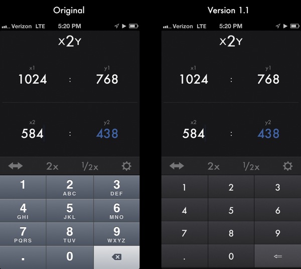
But I’d be lying if I didn’t admit there was one thing, visually, about the app that was bugging me. And that was the default Apple keypad.
Not that I don’t think Apple’s keypad is a great design. It looks good and it functions perfectly. But because I had chosen to use Futura throughout the app, the default keypad’s use of Helvetica just didn’t quite blend with the rest of the app’s look. It’s the kind of thing maybe most people wouldn’t notice, but my audience here is graphic designers. So this was important, no matter how much I tried to convince myself otherwise.
I also didn’t like the color of the keypad for my app, nor the use of letters under the keys. The letters make sense for phone dialing, but they were adding visual clutter that is completely unnecessary for my purposes.
Because I was a noobie to programming, I assumed that changing the default keyboard would be a huge pain in the butt. So when releasing 1.0 I decided to live with it.
After all, you have to make compromises to ship apps, right?
Then I started playing around with making the app iPad compatible, and I quickly realized that the iPad doesn’t have a default keypad. You literally have to roll your own keypad if you don’t want to use a full keyboard.
So I figured I have to build my own keypad soon, anyway. Why not put it in the iPhone version first?
As with many other aspects of iOS app creation, coming late to the party made my life a lot easier. Switching out input views in iOS is a lot easier now than it was when iOS was much younger. That’s not to say it wasn’t still more work than it should be, however.
While dropping in my new, pretty, Futura keypad, I got to see firsthand what so many of my developer friends have told me over the years. Every time you solve a problem in your app, two or three new problems seem to crop up. I pop in new code, and something breaks somewhere else. You think you’ve got one new thing to learn how to do, but you actually end up having to learn how to do four or five other things before you’re done.
It was a huge reminder of just how little I really know, having just built one simple app. But it was also encouraging, because ultimately I was able to figure it out on my own. One more thing I’m confident I can do the next time it comes up. And several other things I understand about how classes and nibs work that I didn’t know.
A look at the before and after, I think, speaks for itself. This is a huge improvement to the app.

Version 1.1 was submitted last night, and will be available as soon as Apple approves. I also added in a few extra ratios to the list of Common Aspects whlie I was at it.
Now to tackle the rest of that iPad layout.