I’ve been looking closely at iOS 7, and like many designers I have mixed feelings. Some of the changes, like the expanded use of motion, are a breath of fresh air. Animation is coming to the forefront and will only be further explored in the years to come. And that’s very exciting. In other areas, meanwhile, such as the heavy reliance on type rather than icons, the over-reliance on plain white backgrounds everywhere, and the lack of clear separation between elements such as the status bar and the title bar, I’m a little less convinced. (And I won’t participate in the icon debate, except to say that there’s more work to be done, I hope.) But I understand that this is a rough draft, that all Apple interface design is a work in progress, and that the “big shifts” (just like the original OS X) usually take a few iterations before Apple works out where they may have taken it too far in a particular direction.
And that’s where my work moving forward comes in. Unlike Apple, I only have a handful of apps to conform to this new iOS 7 design language, so I can take some extra time with them. And the number one guiding principle for me is this: Don’t overcorrect.
I think a lot of designers will be tempted to strip out all adornment in their apps and try too hard to copy the stock Apple apps. This would be a mistake.
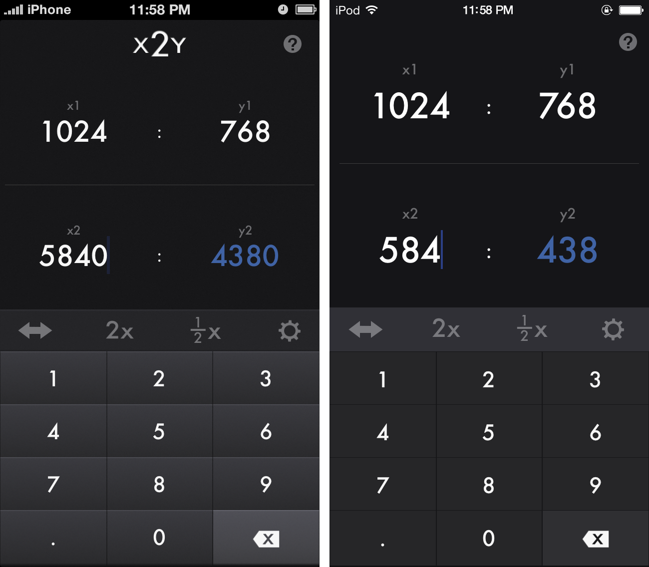
Take my app x2y, as an example. I started thinking about what I would need to do to make this fit in with iOS 7 immediately following last Monday’s keynote. And what I’ve concluded is that it does need some work. But not as much as I initially thought.
Sure, I can further flatten out the already pretty flat toolbars, remove the highlights and shadows from my custom number pad, maybe back off on some of the background texture. And I can get rid of some of the custom adornments that don’t really need to be there, such as the logo on the top of the interface. But should I switch from the dark grey to a more iOS 7-common white background? I don’t think so. When I use this app, I’m usually in my dark office, with my focus on my iMac’s 27” screen. The last thing I want is my iPhone or iPad blasting white light at me just so I can make some image size calculations.
And what about the font? Helvetica Neue Light is nice, and I actually like the system-wide movement toward thinner fonts on Retina screens. On the other hand, Futura is a major part of x2y’s personality. Those sharp, beautifully recognizable numbers were chosen for a reason, and I can’t see replacing them just because the system font has changed. I can, however, in the interest of improving clarity, make those fonts larger in some places.
After a few days of playing around, what I ended up with is something along the lines of this. A change, to be sure, but not a drastic one. A look that won’t be out of place on iOS 7, but would still work on iOS 6 as well.[1]
 One of the nice things about iOS as opposed to OS X is that once your app is launched, it takes over the entire screen. So while you want it to fit in with other apps on the system, there is plenty of room for your own app’s personality to shine. You can have a custom look and feel, so long as the user experience is consistent and it doesn’t look too out of touch.
My advice to my fellow designers is to not take the new look of iOS 7 too literally. Remember the core of what Apple’s trying to achieve—clarity, deference, depth—and interpret those principles in your own fashion. Sure, hard light from 90-degrees above is giving way to more diffuse, ambient lighting, and heavy drop shadows and distracting textures are likewise passé. But don’t try to make all your apps look like iOS 7 Mail. That would be counterproductive.
After all, Letterpress looked and worked just fine on iOS 6. Twitterrific fits in nicely on either system. Because good design is good design. It’s much better to be in the position of potentially influencing Apple’s next version of iOS (as those two apps clearly did) than to be copying the current version.
- Note, this is three days worth of work on the next version of x2y. The final product may vary quite a bit as it gets refined over the next few months. ↩