This is a series of posts about the making of my marketing video for Fin. You can see the other parts of the series by following the links below:
1 | 2 | 3 | 4 | 5 | 6 | 7 | 8 | 9 | 10
This is part eight of a series detailing the process I used to make a product marketing video for my app, Fin. I hope I can inspire others to try and make these kinds of videos for their own products, as I think they are pretty essential for selling apps to customers. We may not all have the budget to hire a pro team to make super-awesome videos for us, but we can make something worthwhile if we put in some time and effort.
Slight of Hand
As I mentioned earlier, there was one extra challenge with this Fin video, where I wanted to be sure UI gestures (swipes and pans) were demonstrated in the video. This was tricky, as I wanted to avoid breaking the illusion that the video clips were shots taken with live devices. In those kinds of shots, you’d be able to see a hand in the shot making the individual gestures on the screen. So I had to come up with a way to make this happen without it looking completely fake.
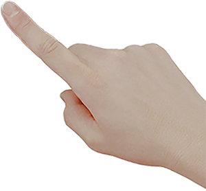
I started with an image of a hand that was cut out of its background perfectly. That took some care with Photoshop. If you’re fortunate, you’ll find something similar and ready-made on a site like iStock. Luckily, I only needed to show single-finger swipes, so the same image sufficed for all of my shots. (I flipped it once horizontally to show a left hand as opposed to a right one.)

The trick was timing the animation of the finger so that it looked like it was actually manipulating the screen. It doesn’t have to be perfect, but it does need to be close. With a careful amount of panning, scaling slightly to create the illusion of pushing down on the screen at the right moment, and a good speed on the panning and rotating of the entire compound clip, the illusion works well enough to not jump out at you on the first viewing, at least.
The important thing to keep in mind is that you want the hand to be part of the compound clip, and you want the animations of the hand itself to take place within the compound clip, while the compound clip is itself being animated independently. The best way to do this is keep all three layers (the device, the screen grab, and the hand) separate while animating the hand. Then select all of them and group them into your compound clip for further animation of the entire clip. This way, your hand will move appropriately with the device and screen while it follows its own timeline and keyframes.
This technique ended up working for the Fin video because I only needed it for a few short shots, and the gestures were simple and out towards the edges of the screen, for the most part. If the gestures are more complex for your app, you may need to come up with a better solution. Taking video of your hand performing the appropriate gestures in front of a solid color background that you can later key out might work, if you can get a decent background cloth that’s contrasting enough in color to your skin tone.
Once you know what to look for, the shots look pretty fake compared to a real hand touching a real screen. But 99% of your viewers won’t notice it at all the first time around. They’ll be paying attention to the screen.
And how many of them are going to watch more than once, realistically?
Making adjustments for timing
Once you’ve had fun with the camera movements for each shot, and you’ve put them all into your timeline, it’s time to tidy up the timing a bit. Some clips may be too long while others too short. Use your best judgement. Watch the video from start to finish several times to get a feel for the balance. Don’t take too much time on this yet, however, as you really won’t nail down the final timings until you have your music in place. Music will help guide you on when to make transitions between shots more than you might think.
Speaking of music, that will be the subject for our next part in this series.