Last week I was making screenshots[1] for the next version of Setlists. This is a necessary ritual for any major new app update, as any developer could tell you.
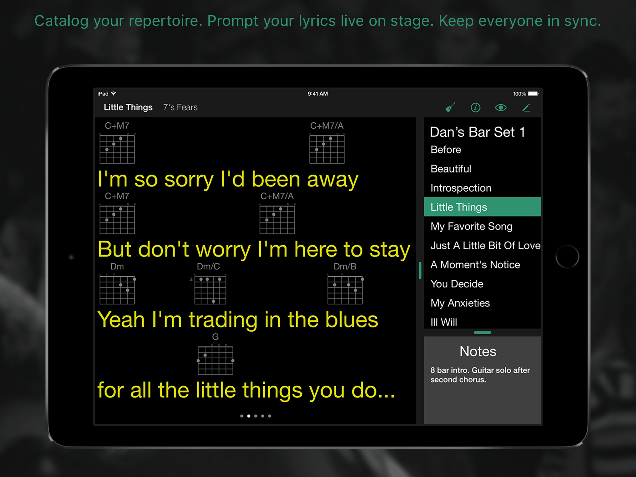
At Bombing Brain, we spend a lot of effort to present our apps in the best light possible. We add some copy to the pictures to give direction about what is going on in the shot. We show the app running on the device, rather than just showing what is on the screen alone. And, of course, we doctor up the status bar a bit so that it’s nice and distraction-free. (Apple even goes as far as recommending this last step.)
These are mini ads for the app, after all. For many customers, this is the only deciding factor for whether or not the app gets downloaded. We’d better make it count, in other words.
While I was working on one particular shot this time around, I ran into a dilemma. Setlists is a lyric prompter, and I wanted to show what the live view looked like while prompting a song. (Since lyrics are the property of the songwriter, we always use lyrics by a close personal friend, Rik Avalos, who has kindly granted us permission to do whatever we like with his words while promoting our app.) Looking at the words on screen for this particular verse, the second line was wrapping. It was too long to fit.
It looked okay; the app was doing what it was supposed to do. Any singer looking at this screen would be more grateful the words were there than critical of the less than ideal typography.
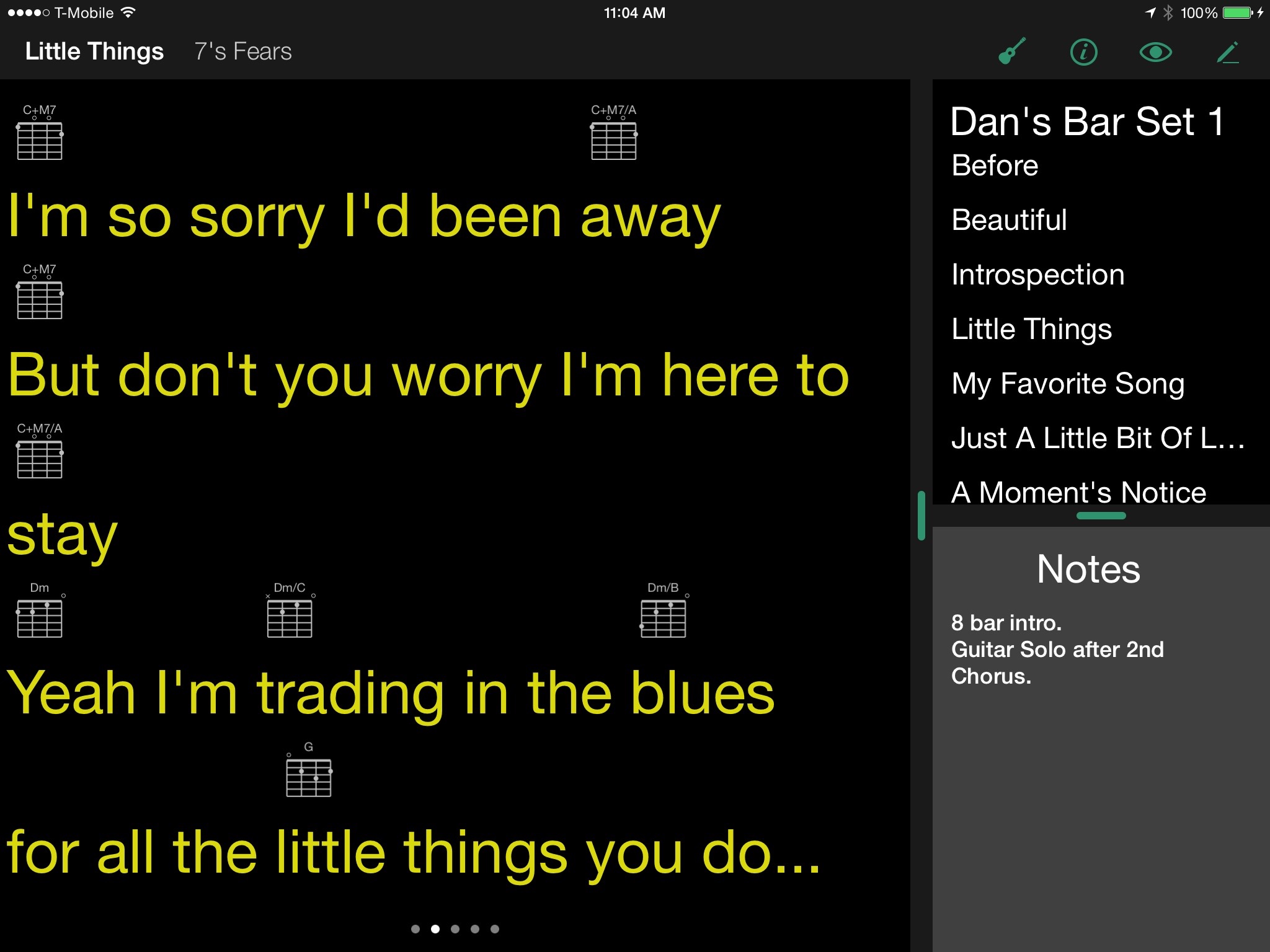
But this wasn’t a live session. This was a promotional picture. I wanted the app to look gorgeous. So I went back to my iPad, put the song into edit mode, and shortened the line of lyrics so that it would fit on a single line. “But don’t you worry I’m here to stay” became “But don’t worry I’m here to stay”.
Is this a lie? Obviously, I owe an apology to Rik for slicing out a word in the name of marketing.[2] But is this a problem ethically between me and my potential customers?
This got me thinking, of course, about McDonald’s.
Lots of folks have made the joke over the years that the promo pictures of McDonald’s hamburgers look nothing like the actual Big Macs and Quarter Pounders you get when you order them. These glory shots of the idealized burger are even considered “false advertising” by some of my friends. But as I sat there doctoring my screenshots, I thought, maybe not. Maybe what McDonald’s is doing with their promo shots is no different from what I’m doing here for my apps.
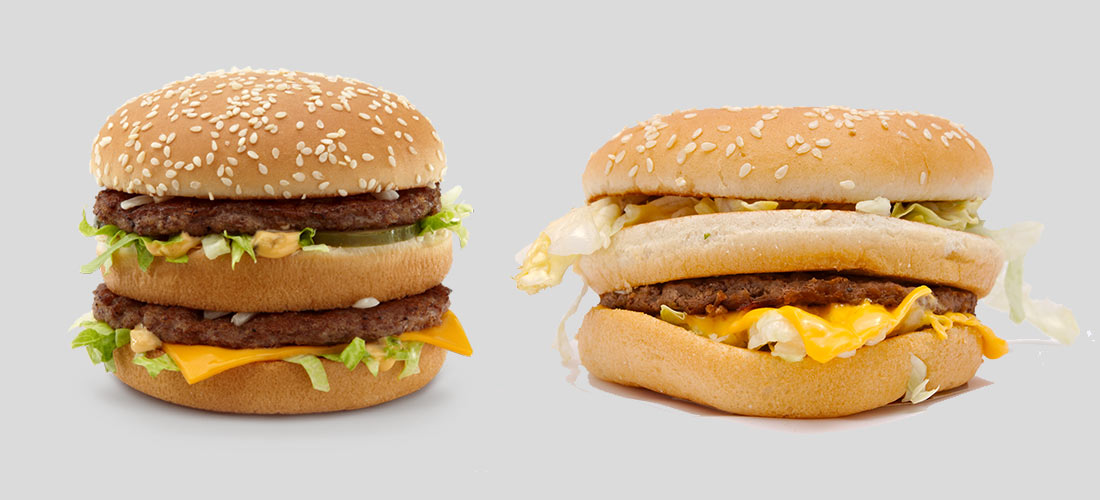
The problem with a picture of a hamburger is that people don’t generally look at hamburgers. We eat them. The translation from taste to vision is a translation. A picture alone cannot convey the experience, the feeling of enjoying the taste of a good burger.[3] A Big Mac, a real Big Mac, tastes way better than it looks, in other words. It makes you feel like you had a great dining experience. So the picture, rather than showing what the burger actually looks like, needs instead to convey what eating that burger feels like.
If people were somehow disappointed that McDonald’s burgers don’t live up to the pictures, that would be reflected in their sales. If anything, the continued success of the franchise demonstrates that this isn’t an issue.[4]
And at this point, I’ve lost the purists, who think I’m spewing marketing nonsense to justify my Photoshop tinkering. But you have to admit, a screenshot of an app can’t really convey what it’s like to use an app. And if a picture is all we have to show you—if it’s the one thing we have (besides the icon) to keep the attention of customers long enough to become interested in hitting that GET button, you had better believe I’m going to do what it takes to convey how much they’re going to like using my app, not just looking at it.
Obviously, we can take this too far. McDonald’s can’t add bacon to the Big Mac in its promo shots if the Big Mac doesn’t actually come with bacon. In the same way, I can’t show things in my screenshots that the app simply can’t do.
But you’d better believe that if I can massage my content to look a little prettier, I’m going to spend the effort doing it. And I’m going to feel just fine when I wake up in the morning.
Note: Charles and I talk about this topic in more detail on this week’s Release Notes podcast, episode 115.
- Actually, they shouldn’t even be called screenshots. Screenshots are a snapshot of your device’s screen, as-is. App Store screenshots are a lot more like promotional images, much like you see in retail stores, web sites, magazine ads, etc. We’re a long way from the days when Apple enforced the rules on what you can and can’t include in a screenshot. Take a look around the App Store, and you’ll see plenty of people have gotten very creative with how these are used. ↩
- He’s fine with it, by the way. ↩
- Whether or not what McDonald’s makes can be considered a good burger is of course, debatable. That’s beside the point. I haven’t eaten a Big Mac since I was a kid. But billions and billions of burgers later, you have to admit, they’re doing something right. Clearly, a large segment of the population considers this good food. ↩
- I’m using McDonald’s here, by the way, as a representative of just about any food chain that does this sort of idealized promotional photography. This is a practice that is by no means limited to this one company. It’s ubiquitous in the industry. ↩