I’ve seen a number of complaints about the iPhone X keyboard implementation. “So much wasted space.” “They should put the spacebar down at the bottom, where it always was.” “They should fill that space under the spacebar with emoji buttons.” And so on.
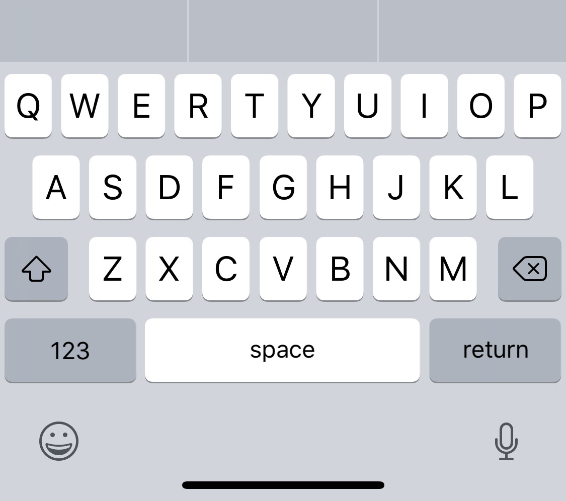
All of these suggestions strike me as poorly thought out. I immediately understood why Apple made the choice to leave that area mostly blank. The space bar is where it used to be. The home button used to be where that empty space is.
Given how difficult it is to change muscle memory, and given how much of a stretch it actually is to reach the bottom of the iPhone X in real-world use, putting frequently used buttons down at the bottom is a really bad idea.
I got to test this firsthand with my own app, x2y. I wasn’t expecting to get my iPhone X version finished in time for the release date, but at the last minute I had some time, and I was able to handle all the changes I felt were necessary—except one. My custom number pad still reached down to the bottom of the phone. I figured this would not be ideal, given what Apple had chosen to do with the built-in keyboard, but not having the hardware in my hands, I figured I’d ship it and see what happens.
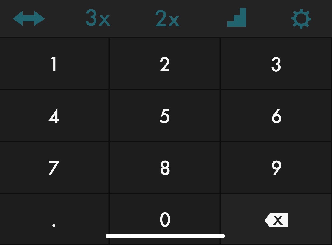
Sure enough, as soon as I played around for a few minutes on my own iPhone X, I knew this could not stand. I was accidentally typing the wrong numbers constantly. And it was just too much of a stretch to get to that bottom row regularly.
So I fired up Xcode again and started figuring out a fix. In the end, the new design technically doesn’t look as good, but in practice it feels a thousand times better. My number pad isn’t quite as high up as Apple’s own built-in version, but it’s up above the Safe Area, at least.
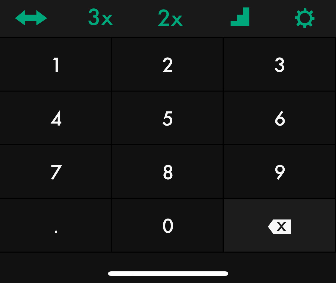
So there you have it. Apple clearly did the right thing with keyboard placement on iPhone X. As I mentioned before, just because your screen goes edge-to-edge, that doesn’t mean your UI should. The extra space is most often best filled with background color.