When I came up with the original concept of RECaf, shortcuts hadn’t been announced yet. I knew the key to any data-logging app is making the act of adding new entries as simple as possible, so I focused all my efforts on reducing log friction. If it takes too much work, you won't get into the habit of logging daily.
I put a ton of effort into designing the simplest logging process possible. RECaf only needs three pieces of information to make a log entry: a source, an amount, and a date. Since most of the time you want to log an item you are consuming right now, RECaf can usually assume the date is now. If you tend to have the same sources in the same amounts regularly (we are creatures of habit, after all) RECaf can notice those combinations and make them more readily available.
Surfacing your top three most frequent sources automatically and making them one-tap buttons, then, became an easy addition. Adding a favorites pane for any extra items you sometimes log helps to capture most everything else. Even custom logging infrequent, non-favorite items I managed to get down to just a few taps on a single screen. Choose a category, source, amount, adjust the date if necessary, and you’re good to go. No scrolling through long lists just to find what you want.
3D Touch shortcuts on the home screen icon, the today widget, and a watch app give you those most frequent items in even more places.
But then Apple announced shortcuts this June, and things got way more exciting. People could just invoke Siri and say “Log Cappuccino.” And that was it. I knew I had to get this into my app immediately.
Using shortcuts with RECaf all summer has been a game changer for me. It’s supplanted most of the need to ever have to log the “old fashioned way.” Shortcuts have finally given me a reason to actually do something with Siri beyond setting a timer or adding reminders. I’m going to be looking to set up shortcuts in as many apps as possible this fall.
But there is one issue with shortcuts—they need to be set up by the customer in order to work. And in order for that to happen, the customer needs to know shortcuts exist in the first place.
And so we run into our old nemesis: discoverability. This is going to be the central challenge for designers working to add shortcuts to apps. Doing this poorly will cost you dearly. Your customers will overlook one of the best features to come to iOS in years. And that would be a real shame.
Counting on Apple alone to make people shortcut-aware would be a mistake. Remember iMessage apps? How many of those caught on with your non-tech friends?
Counting on Siri Suggestions would also be unwise. What are the chances your app will stand out in a suggestions list with 50 other apps competing for attention?
So how did I approach discoverability of shortcuts in RECaf?
Let me start by saying that I do not like to bombard my customers with tons of pop-ups and annoying messages trying to teach them about the app. Especially on first launch. We’ve all downloaded lots of apps at this point. The first launch sequence often becomes a battle of how many screens so I have to swipe or tap though to get to the darn app, already?
If you make the first launch more than a few screens, you’re lucky if the customer remembers anything you tried to teach them. If there are tons of permissions pop-ups involved, chances are they will tap through everything without reading.
I like to stick to what’s absolutely necessary on that first launch. For RECaf, that meant getting HealthKit access permission (because RECaf relies heavily on HealthKit) and (optionally) getting a free trial started. This way the customer can get the full experience of using the app right out of the gate with minimal interruption. You will need to decide what is most important for your particular app.
RECaf does not ask for notification permissions on first launch. (I save that for after your first log.) No prompting for ratings. (How can they rate an app they haven’t used yet? That comes after several days of use.) No tour of the entire interface. (They can do that on their own.) No signing up for any newsletters, etc.
I want my customers to get in and start logging.
So where do I add shortcut prompting?
Well, first I wanted to be sure that setting up shortcuts was easy, and that it could be discovered without any prompting. Not everyone will find shortcuts in RECaf on their own, but it should be possible at least, right?
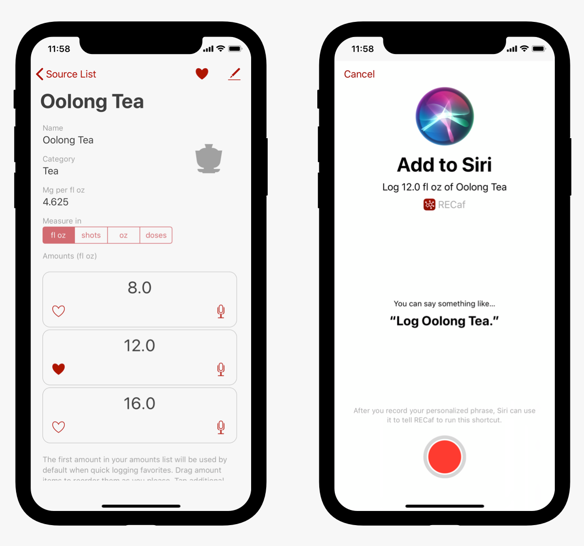
After a couple of iterations, I ended up with buttons placed on every amount listed on the source detail page, with a microphone icon[1], to indicate the customer would need to record a voice phrase. Maybe this person has never heard of shortcuts. Maybe they’re just curious and want to know what that button does. They tap the microphone, and Apple’s standard shortcut creation screen comes up and does the rest for me.

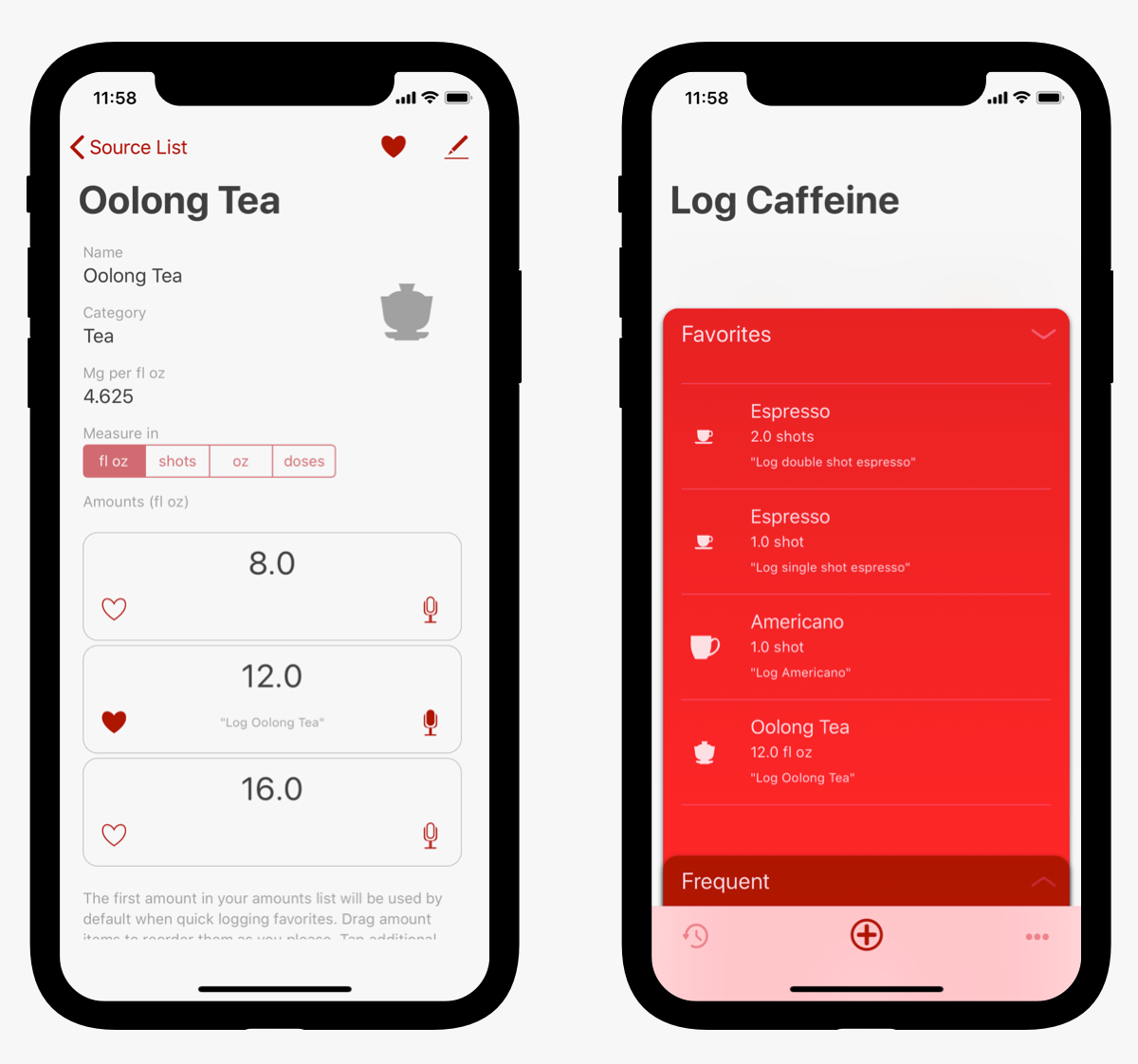
Once you’ve already recorded a shortcut for that amount, the phrase you recorded appears, and the icon is filled in. This makes it easy to see which amounts already have shortcuts, and it reminds you what you need to say to invoke that shortcut. Tap on the filled icon and you can edit or delete the shortcut. I show the phrases on the favorites screen as well.

So that takes care of making it possible to create a shortcut at any time for any source. But I’ll be lucky if more than a few people go hunting into the source detail screen on their own.
So how to balance making people aware of shortcuts without bombarding them?
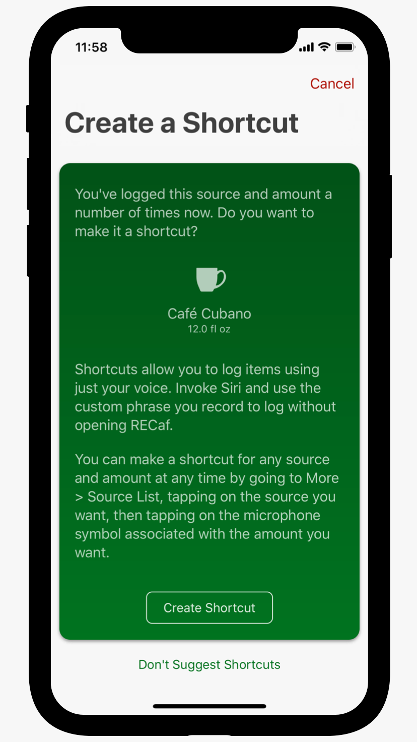
I came up with a nice compromise. Here’s the scenario. You log a particular source/amount combination. (Say a 12 fl oz Café Cubano, as an example.) RECaf checks to see that all of the following are true:
- You have logged this exact combination of source and amount at least five times
- You have not already created a shortcut for this source/amount combo
- This combo is one of the first three where a shortcut was suggested, and then you created the shortcut.
- You haven’t yet indicated that you’d like to stop being reminded about shortcuts
If all are true, then after the confirmation screen indicating your log was successful, this screen will pop up:

From here, you can read about shortcuts and their usefulness, get a tip on how to create a shortcut for any source in the future, and of course tap a button to create the shortcut right there if you like. I also give you a way to either cancel just this particular shortcut’s creation (maybe you are in a place where you can’t talk right now), or inform RECaf that you’d prefer not to get these reminders in the future. That way, if you want to record the shortcut later, it will remind you again next time. But if you hate the whole idea of shortcuts, you can ignore them forever.
Note my thinking here:
- At least five times. I’m not going to push you into shortcuts on day one or for everything you log. It’ll likely be days before you see your first shortcut prompt. That’s okay. The app is still great without shortcuts. It’s just better with them.
- The app is making note of your behavior and predicting your future intentions. The simplest form of machine learning, to be sure. But machine learning all the same. (I’ll have more to say about the more complex machine learning surrounding reminder notifications in a later post.)
- The prompt happens in response to an action. It doesn’t just show up on launch, when you’re likely trying to quickly log something. It waits until you’ve done your logging and then prompts you with a helpful tip to make logging that exact item even faster next time.
- After you set up three of these shortcuts, RECaf stops. By then, you get the idea behind shortcuts, and you’ve been shown more than once how to set them up on your own. Maybe you didn’t read that screen carefully, but chances are, you’ll get curious enough to go looking elsewhere in the app at that point.
I know this isn’t perfect. If you always log from your watch, for instance, you’ll never get prompted. If you drink something different every day, it’ll be quite a while before any shortcuts get suggested. Some people will just cancel the screen every time without reading it or just tap the button and get confused. At the end of the day, it’s still a pop-up screen, which is an interruption and a potentially unpleasant surprise if you have no interest in Siri or voice-activated computing. But like I said, it’s a compromise. If RECaf bugs you once, you tell it to never bug you again, and it obeys, I’m okay with that.
The alternative is the majority of my customers missing out on what I think is the killer feature of the app.
I’m very curious to see how other designers and developers approach this problem. It’s challenging designing these solutions in a vacuum, before you get the benefit of seeing other approaches. Perhaps once I get a glimpse of some other apps with shortcuts, I’ll revisit and develop it further.
I’m also curious to see how shortcuts are adopted by my customers. With any luck, the majority will be logging with their voices a few times a day, then carrying on, only launching the app occasionally to see their stats.
RECaf will be available shortly on the App Store. To find out more, visit the web site or sign up on the mailing list.
I settled on a microphone, rather than a Siri icon, as I was not clear that using the official Siri icon would be allowed by app review. Better safe than sorry. Besides, I’m not sure the average customer would recognize the Siri icon at this point, or be able to surmise how Siri and my app are related at this stage. A microphone is a pretty universal icon for recording something at least. You may mistake it for recording voice notes, or something. But if you tap it and learn about shortcuts instead, it’s not the end of the world. ↩︎