all micro contact rss

Thoughts on the Hello Again Event

A few quick takeaways from Apple’s Hello Again event:

  • Accessibility is one of those things that makes Apple stand out as a company. They’ve cared about it for a long time, but they’ve upped their game even further in the Tim Cook era. Just as they have on environmental issues, diversity, social justice and equality, and on and on. They have a long way to go before they are perfect, but they strive to be better than what they are. And you can’t deny their impact on people’s lives. Some see Apple opening their keynotes this way as a distraction. Or “the boring part.” Some cynical people probably see it as a smokescreen. I see it as a clear, public demonstration of what the company values. And that makes me feel good as a customer and shareholder.
  • Apple is out of the monitor business. When Phil Schiller is on stage saying “Hey, check out this cool new LG Monitor” you know Apple has no plans to make a monitor ever again.
  • The MacBook Air is done. They may be keeping the 13-inch around to sell out current inventory, but the new Pro is now smaller than the 13-inch Air ever was, and the 12-inch MacBook is already smaller than the 11-inch Air. So size is no longer a benefit. The only remaining benefit of the Air—cost—is answered by the 12-inch MacBook, the entry-level Touch Bar-less MacBook Pro, and my next bullet point.
  • The days of the sub $1,000 Mac are done. I thought the Air would stick around for another generation because of this price tier, but then I thought about it more carefully. Low-cost PCs make almost no sense anymore. People who need the power of macOS are becoming a smaller group with every passing year. Prices will continue to reflect the shrinking market. Apple has an entry-level machine for people who are budget constrained, and it’s only $599. It’s called the iPad Pro. That machine does everything the target audience for an 11-inch Air or 13-inch Air would need and more. The MacBook and MacBook Pro 13 with no Touch Bar will cover anyone else, albeit at a slightly higher cost. The price you pay for needing more power than the average person. Pretty soon, the only people who need macOS will be certain kinds of pros. So it’s pro machines from here on out. And those pro machines are going to keep getting more expensive. Don’t worry; you won’t be upgrading them very often.
  • Laptops are where Apple sees pros moving forward. I don’t think they’ll kill the iMac soon, necessarily, but I wouldn’t be surprised if the Mac Pro were truly dead this time.[1] The Touch Bar is a perfect demonstration of where Apple wants to innovate. And it’s likely a laptop-only feature. Sure, they could put a Touch Bar on a Bluetooth keyboard, but I’m not 100% sure they will.[2] Which means even the next generation iMac will likely be missing out on this incredibly cool and useful new input device. Meanwhile the MacBook is likely to get a Touch Bar as soon as it’s cost-effective. Apple clearly sees portability as being an important value to professionals. Some may spend 90% of their time sitting in a room alone working, but many other professionals need their machines to go wherever they do. And with Thunderbolt 3, it’s easier than ever to take one cable and plug into power, external display, multiple USB peripherals, web cam, and more when at your home office. The laptop becomes as powerful as a desktop workstation in a second with one cable, yet still retains the ability to be taken elsewhere when needed.
  • The Touch Bar is a big deal. I’ve heard some say they aren’t sold on it yet, but once they get one, I think they’ll change their tune. This is the first input device for macOS since the trackpad that will change the way we use our laptops. Because it’s built in. And it’s in the perfect place, just above where my hands already are. If developers are smart about the controls they put up there, and people can customize as much as it appears they can, it’ll soon be hard to imagine life without the Touch Bar. So much so I would say that even using your MacBook Pro in clamshell mode with an external monitor, keyboard, and mouse is going to become less popular. The Touch Bar will be that useful, and you will notice when it isn’t there. I’m so stoked about the Touch Bar that I’m considering not replacing my iMac next year, as I had planned. Instead, I’ll get a 13-inch or 15-inch Pro and finally consolidate into one Mac again, after six years of using a 2-Mac setup.
  • The Touch Bar is not cheap. Apple created a “dumbed-down” MacBook Pro to help bridge the gap between Air buyers and Pro buyers. It’s telling that they left in the gorgeous new wide-color display and the Thunderbolt 3, but took out the Touch Bar as a cost-saving measure. There’s nothing “Pro” specific about the Touch Bar itself. The emoji alone will appeal greatly to consumers. But this input device is debuting on the Pro because it’s a costly add-on for Apple, and the highest-margin machines are the easiest place to add such a feature. I wouldn’t be surprised if next year’s MacBook only gets the Touch Bar on the high-end model, too.[3]
  • The new MacBook Pros have finally gotten thin and light enough to make the 12-inch MacBook less appealing to me. People make fun of Apple’s obsession with thin, but this is a massive deal to people like me. I use my laptop every single day. I travel around New York City with it, on crowded subways and busy sidewalks. On busses, trains, and coach-class airplane seats. And it’s seldom the only thing I’m carrying. My laptop can never be thin enough or light enough. If I had the last generation of MacBook Pro, I’d be leaving it home much more often and opting for my iPad when moving around. The new Pro seems to have crossed the threshold of light and small enough to become my one-and-only Mac.[4] I could not be more excited about this.
  • Apple’s long-term strategy for the Mac could not be more clear. They are consolidating all the various models into one line in three sizes: 12-inch, 13-inch, and 15-inch. The larger ones will be more powerful and expensive, the smaller more portable and cheaper. Choose accordingly. In a few years, I suspect there will be exactly that many laptops—and perhaps just that many Macs in total—from which to choose. This makes perfect sense for a category of technology that, frankly, is becoming more niche by the minute. Keep making it more powerful and more portable, and add innovative features like Touch Bar that give you the benefits of multitouch input, but in a way that makes sense within this form factor. It may not be your ideal picture of the future of macOS, but it’s definitely a strategy, and one that Apple thinks is best for its long-term business. And looking at the evolving market, it sure seems like they know what they are doing.

Taking the Enthusiasm out of Tech

I remember when I bought my first FireWire Mac. I was so excited at the prospect of having a port that could allow me to record multiple tracks of simultaneous audio without missing a beat. Sure, it meant I had to get a whole new I/O breakout box to take advantage of all that speed. But the possibilities were so enthralling, I couldn’t wait to spend all my money. And all my tech enthusiast friends were right there with me.

Apple left a few legacy ports on the Mac at the time, but I wasn’t about to use them. I bought the new thing so I can take advantage of the new stuff, man. That’s what being a nerd is all about.

Yesterday, Apple announced an all-new MacBook Pro with not one but four Thunderbolt 3 connectors. Thunderbolt 3 is twice as fast as Thunderbolt 2. It allows 40 Gbps of throughput. So this new MacBook is capable of driving two 5k monitors along with its own internal Retina display, and who knows how many other amazing peripherals all at once. I can plug in one cable to my external monitor and get power, display, and whatever other ultra-fast peripherals I choose to plug into the back of the monitor. This is a nerd’s wet dream.

It makes FireWire seem like Flintstones-era technology.

So imagine my surprise when the response from the Apple tech enthusiast community was basically this:

“I HAVE TO BUY A DONGLE. THIS SUCKS!”

I’m not joking. I saw one tweet in my entire timeline yesterday that had anything at all to say about how amazing Thunderbolt 3 is.

@jcieplinski It’s frankly mind-boggling what Thunderbolt 3 can do.

— Greg Pierce (@agiletortoise) October 27, 2016

What happened to the tech community? When did we stop getting excited about tech, and instead spend all our time making “Courage” jokes?

Healthy criticism is necessary and a force for good in society. This is not that. This is mistaking being critical for being intelligent. We’ve glorified those who nitpick and have rewarded them so much that they have no choice but to up their game every year. And as a result, we’ve taken all the fun out of being a nerd.

Whenever I get my next Mac, I’m going to have to do a lot more than buy a few dongles. But I’m not complaining. I got a lot of years out of my old FireWire 400 I/O box, which I adapted to FireWire 800, and then Thunderbolt, with—you guessed it—a series of dongles. But it’s time to move on. Maybe that means waiting another six months until I can save up the funds to make the leap, but so be it. I’m excited about the possibilities.

More on Sticker Pack Screenshots

As I continually iterate on the Mixologist Sticker Pack, I’m also paying close attention to the iMessage App Store and its trends. Screenshots for sticker packs are still largely disappointing. But some of the craftier developers are coming up with presentations for their stickers that are quite nice.

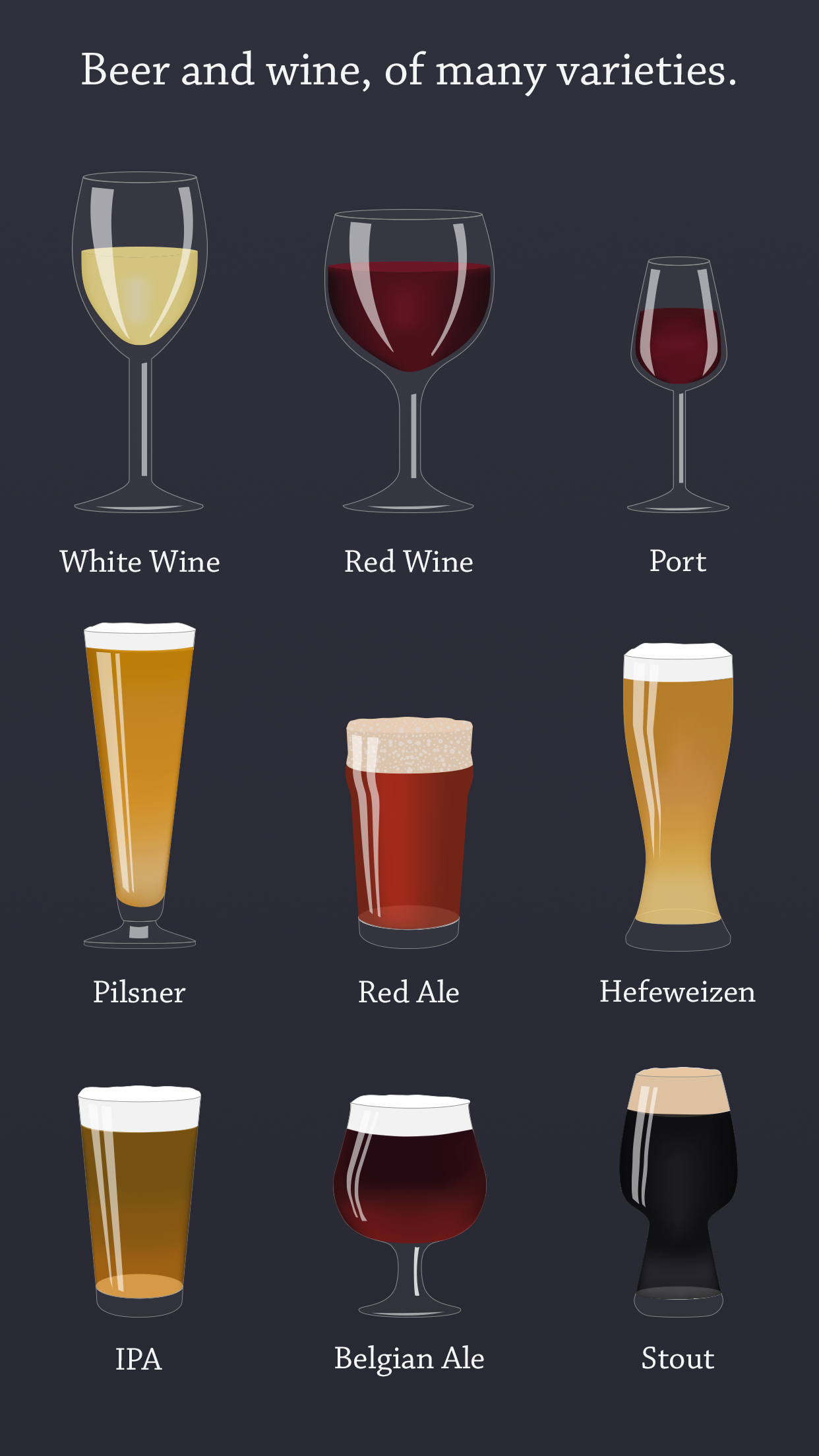
My favorites have done away with the entire notion of presenting actual screenshots, and are instead just presenting the stickers in rows on a colored background. This makes perfect sense, as anyone buying stickers gets the idea, generally, of what stickers can do. What a buyer wants to know is what the stickers look like, more or less. And that’s it.

I ended up taking this approach for the latest version of Mixologist and the Leo Collection, and I think the results are quite good.

![Mixologist screen shot one](http://joecieplinski.com/blog/content/images/2016/10/mixologistSS1.png)

Mixologist screen shot two

There’s just no way to make a shot of an iMessage conversation look particularly eye-catching. By simply showing the stickers in rows, I’m both presenting my stickers in the best light, and giving my potential customers a better sense of what they are buying.

You can see the full set of five screenshots on the App Store.

Adding an App Store Link Inside a Sticker Pack

For version 1.2 of the Mixologist Sticker Pack, I wanted to do more than just add a few more new drinks.[1] Taking a lesson from my friend Curtis Herbert, I wanted to add something to the app that improved it as a business. In this case, I wanted a link to my other sticker pack, the Leo Collection, inside the Mixologist.

Seems like a no-brainer to let the customers of one of my sticker packs know about my other packs, right? After all, these are people who have demonstrated that they know about, like, and will pay for stickers. They are a perfect target demographic.

Adding a link to the App Store inside an iMessage extension is trickier than it sounds, though. This is because extensions in iOS don’t get direct access to openURL. So you can’t simply add a link button that will launch the App Store app.[2]

So how do I link to the Leo Collection from within the Mixologist? That took a bit of asking around to my developer friends. I knew it was possible, thanks to the many great sticker packs offered by Iconfactory. At the bottom of each of their packs, there’s a button that launches a new view with all their packs listed. Tap on one, and you get an App Store page, complete with a Buy button, right within the extension. Nice.
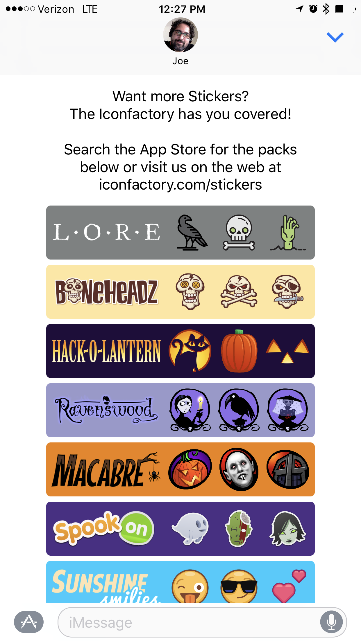
Iconfactory More Page

So how are they doing this? I asked a few friends (Sam Gross and Jeff Grossman) while attending CocoaLove last week in Philly, and as people in our community tend to do, they immediately started brainstorming. Within thirty seconds, one of them suggested SKStoreProductViewController.

If you’re wondering, “What the heck is a SKStoreProductViewController,” don’t worry. I hadn’t heard of it before, either.

Turns out, as of iOS 6, StoreKit includes a controller that will only show you a specific App Store product page, right within your app. No need to link out to the App Store app. No need to bring up a Safari View Controller. It’s a nice tool that I had completely overlooked previously.

And best of all, it works within an iMessage extension.

Initialize the view controller with your product id (and even your affiliate token, if you like) and you can bring up the page for any product you want.[3]

I went home after CocoaLove and tried it. Sure enough, that was how Iconfactory was pulling off this trick.
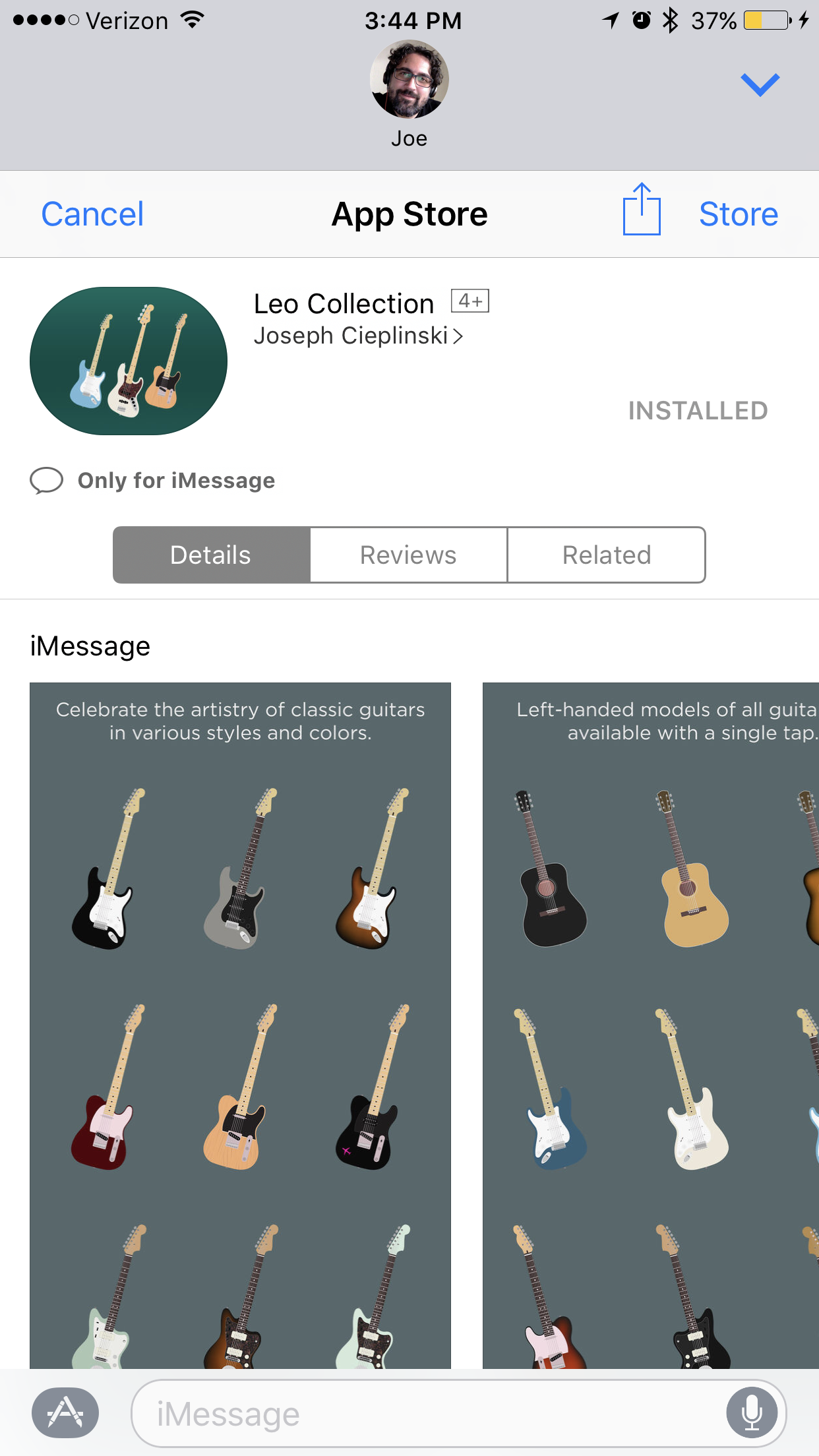
Leo Collection inside an SKStoreProductViewController

One small downside to the SKStoreProductViewController: It’s no good for prompting the user for reviews. I wanted to have a “Leave a Review” button on the same page that launched a SKStoreProductViewController with Mixologist as the product. But it turns out that not only can you not initialize the view on the Reviews tab automatically; even if the user goes to that tab and taps the “Write a Review” button, nothing will happen.[4]

Still, I managed to get a link to the Leo Collection into the Mixologist pack. It’s unobtrusive, sitting way down at the bottom of the collection, so as to not get in anyone’s way.[5] But it’s there, if one of my customers is curious.

Now I just have to put a link to Mixologist Sticker Pack inside the Leo Collection.

If you have more than one sticker pack, I suggest giving this a try. It doesn’t take long to get the controller up and running, and the potential benefit is well worth it.

Update: Daniel Farrelly (@jellybeansoup) informs me that you can use openURL in an extension, as long as it’s on the extensionContext. I still prefer using the SKStoreProductViewController to keep my user inside my extension and not bounce them out to the App Store. But I may look into this as a way to make a Leave a Review button work.

  1. Don’t worry. I also added three new drinks. Port wine, the Kir Royale (as requested by Jean MacDonald) and the French 75.  ↩
  2. My guess is Apple doesn’t want people getting bounced out of Messages unexpectedly from an extension. There are probably also security concerns.  ↩
  3. I recommend doing what Iconfactory does, and forcing your extension to the expanded size when you load one of these views.  ↩
  4. The button is there. It looks active. But when you tap it, nothing happens. No error message. No indication that something is wrong. Just nothing. Poking around, it seems that Apple wants it this way, for some reason. The button used to work, but stopped a few major versions of iOS ago. Radars have been open on it for years. But all indications are that it was disabled intentionally by Apple. It’s a shame, really. It would be nice to make it just a bit more convenient for users to leave a review.  ↩
  5. Maybe it’s too well hidden, in fact. I figured it best to err on the side of subtlety, rather than hitting people over the head with it. Time will tell if I should do something to make the button stand out a bit better.  ↩
On Making Quality Sticker Screenshots

The bar for iMessage sticker pack screenshots is really low right now. Take a look at some of the sticker packs on the App Store, and you’ll soon see what I mean. Many sticker packs have one or two screenshots max; many are obviously hastily snapped from within iMessage without much thought to presentation. It’s a huge missed opportunity. I can’t tell you how many sticker packs I’ve passed over because of poor quality screenshots.

I know making screenshots of iMessage is a huge pain. The amount of Photoshop work I had to do to make my screenshots for the Leo Collection would surprise most people. And I don’t even think they turned out as nice as I’d like. But it was worth it to at least present my stickers somewhat effectively.

For my new Mixologist Sticker Pack, I’ve rethought my approach to screenshots, treating them more like I do my regular app screenshots. I hope they convey the quality of the pack even better.

You have one chance to sell your stickers to a prospective buyer. Those five images are pretty much all you get. No one is reading your description text for stickers. Believe me.

I thought developers had learned this lesson years ago, but perhaps the influx of designers being able to create their own packs without code has resulted in many newcomers who don’t yet understand how important screenshots are. Or perhaps more likely, people are only experimenting with stickers and are not really sure if they are worth the effort.

I can assure you, crafting a nice set of stickers, then presenting it in such a slapdash manner won’t get you good data on whether the pack was worth it.

Here are some tips for creating effective sticker screenshots. If you want me to buy your stickers, anyway. [1]

  • Have five of them. Seriously. You get five. Don’t use two.
  • Show me as many of the individual stickers as you can, so I can see the variety and quantity available. If you have so few stickers that you can’t present them in an interesting way over five shots, you probably don’t have enough stickers in your pack. And that’s something I should know before purchasing.
  • Show the full-screen view of stickers. Rows and rows of stickers. If it takes up two or three shots to get a good sampling of your stickers, do it. The shots of stickers being used in conversations are important, but not as important as being able to see what I’m buying.
  • Feel free to add text, color, etc. to convince me why I would want your pack. This is a sales pitch. The same rules apply here that apply to app screenshots. The goal is not to present reality; it’s to sell an aspiration. Think about how McDonald’s presents its products in photos. You are trying to convey visually how good your customers will feel when they send and receive these stickers.
  • Put some time and effort into your screenshots. Design them. You needed a designer to get the artwork for the stickers. Make that same designer spend a day or two designing the best way to package them.

Hopefully as the iMessage App Store grows, we’ll see the quality bar for sticker screenshots move up to the high standard we see in well crafted apps on the main App Store. In the meantime, you have an opportunity to impress with your sticker screenshots while the rest of the store is presenting mostly crap.

If you have any questions regarding sticker packs or screenshots, or you need someone to help you design a set for you, get in touch.

  1. And you probably want to target me for your stickers. I buy a lot of stickers.  ↩