all micro contact rss

Thumb Gymnastics - x2y 2.2

One thing that has bugged me since I got my first 4-inch iPhone is the “thumb gymnastics” involved whenever I need to reach a control that’s near the top of the screen. You know what I mean. Holding the phone one-handed, touching controls with my thumb, I can reach the top left and right corners of the screen for those navigation bar controls, but it’s not exactly comfortable.

I can’t fix this issue for every app on my phone of course, but for my own apps at least, I figure I can do something about it. Put as few controls as possible that far out of reach, and make them controls you don’t need to use often.

For the latest version of x2y, I took a look at the basic flow of how you type in your three values to get to that calculated fourth value. Tap the x1 field, erase what’s already there, type in the new value, tap the y1 field, erase, type your new value, tap the x2 (or y2 if you’re solving for x), erase, type your new value. That’s three times you need to stretch your thumb up from the number pad to change the fields. And erasing the existing value usually involves multiple taps. There had to be a way to make this easier.

Fortunately, x2y has a custom number pad, so I can do pretty much whatever I want with it. I considered adding “next” and “previous” buttons somewhere, but I didn’t want to play with the existing sizes of the buttons already there. The sizes of all the numbers and the delete button match the built-in number pad perfectly.

I could add previous and next buttons to the accessory toolbar above the number pad, but there are already four buttons up there, and I’d still have to move my thumb off the number pad to hit those buttons.

Then I thought, how about some sort of gesture? Swipe from left to right across the number pad to go to the next field, swipe right to left to go to the previous field. Super simple. Not discoverable, but this is a convenience feature, not a necessary gesture to make the app work, so I was comfortable with it. A “power user“ feature.

Since I was adding some gestures, anyway, I decided to add a long press gesture to the delete button as well. Hold down delete, and it’ll empty the entire contents of the field. Much easier than hitting delete three or four times to clear the field.

So now the process of entering your three values is tap and hold delete, type your value, swipe right, tap and hold delete, type your value, swipe right, tap and hold delete, type your value. Your thumb never leaves the number pad.

x2y 2.2 is now available on the App Store.

Riccardo Mori's Essential iOS Apps

Riccardo Mori » My essential iOS apps — Part 1: “This article may disappoint some people. It doesn’t want to be an in-depth guide to ‘The 30 best iOS apps you must have on your iPhone or iPad’. It’s not going to be another piece along the lines of ‘The best iOS apps introduced in 2013″ or ‘iOS apps that everybody must have’. Instead I wanted to focus on a selection of apps that have proven to be indispensable to me over the years, making this article more akin to a retrospective of sorts rather than a review of ‘what’s hot in the App Store now’. Perhaps you’ll find something useful among my ramblings.”

(Via Riccardo Mori.)

Special thanks to Riccardo, as x2y got a special mention in Part 3 of this series.

Lists like this always intrigue me, for the same reason seeing pictures of people’s “1st and 20” iPhone home screens intrigue me. I love to see how others use technology. The things we have in common, the things that we do differently. I often learn a lot, and sometimes I get a tip on an app or two that I hadn’t yet discovered.

There are some really great apps on Riccardo’s list.

Fin 1.1

The reception for Fin has been great, and I couldn’t be more pleased that people are out there using it for their talks, podcasts, etc. I have lots of plans for improvements over the coming months, and as always, your feedback has been invaluable in helping me shape those plans.

Today I’m announcing version 1.1 of Fin is available. There were two important additions for this version.

The first is local notifications. Fin has always had the ability to keep track of its timer, even when you put the app into the background or turn your screen off. If you start a timer, then need to bounce into another app for a few moments, Fin will know how long you’ve been out of the app and adjust the timer accordingly when you come back. This is accomplished not by continuously running while in the background, which would be wasteful, but rather by taking a time stamp when you leave, one when you return, and subtracting the difference.

Considering that Fin is a visual timer, meant to be giving you constant feedback on how much time you have left while you are performing, stepping away for longer periods of time is not a likely use case. But it did bother me that if you step away too long, the timer may run out while you are away and yet have no way to notify you.

If you put Fin 1.0 into the background long enough that that timer actually ran out, Fin would not notify you of this until you came back to the app at some later point. “Timer elapsed while asleep” would show on the screen when you brought Fin back to the foreground, and the timer would be reset. Helpful, but not ideal.

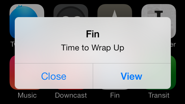
With Fin 1.1, a local notification will fire if the timer runs out while Fin is not in the foreground. This notification can take the form of an alert dialog or a banner, depending on your preferences in the Settings app, and it can even be set to show on the home screen notification center if you’ve turned your screen off. Or, if you prefer not to receive these notifications, you can turn them off entirely.

If you return to the app before the timer runs out, of course, the notification won’t fire.

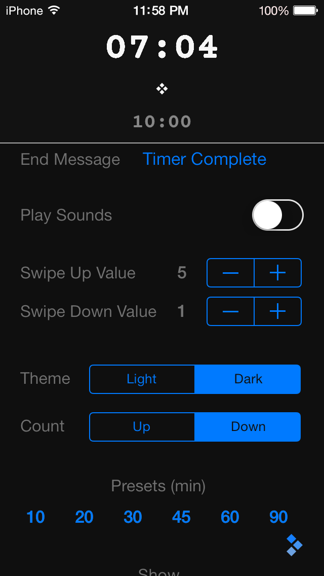
The second improvement for 1.1 is specifically for the iPhone. It bugged me (and some of you) that the iPhone version didn’t have the same ability the iPad version has to see the running timer while on the settings screen. While the settings panel is semi-transparent on the iPad, it is opaque on the iPhone, because there isn’t enough room on the screen to show the timer and all of the settings at once. In 1.1 I solved this by simply adding the timer to the top of the settings panel. Now you can see how your settings changes effect the timer while you make adjustments.

Lastly, on the help page, I added a link to customer support and another to rate the app. I hope those of you who are enjoying Fin will take a moment to write up a quick review or give me a star rating. Your positive ratings will help others find Fin, and help me continue to improve it. Feedback via the support link is always welcome as well.

I have many good ideas for versions 1.2 and 1.3 already, thanks to feedback given to me from my customers. Expect to see some great new features over the next months.

Fin 1.1 is now available on the App Store.

x2y Version 2.1

One thing that I wanted to be certain didn’t happen when I started working on Fin was the neglecting my first app, x2y. While x2y has a great feature set and just this summer received a UI overhaul for iOS 7, I nevertheless don’t see it as “done” by any means. There are always things you can add and other ways to improve any piece of software.

With this in mind, right after the Fin 1.0 release, I went to work on a small update to x2y: version 2.1. This is a minor update that adds two interesting things.

First, x2y is now fully 64-bit compliant. So if you have an iPhone 5s or one of the new iPads with the A7 chip, the app will run in native 64-bit mode. This upgrade was surprisingly easy to do. You have to hand it to Apple; they make the 64-bit transition incredibly easy, even for a guy like me.

Was 64-bit necessary? Of course not. No one running 2.0 and 2.1 side by side will be able to see any difference, even in performance, in such a basic little app. But 64-bit is obviously the future of iOS, and I wanted x2y to be ready for it as soon as possible. I know Apple well enough to know that if you don’t keep up with the changes while they happen, you quickly fall behind and hurt yourself in the long run. So consider 64-bit support a bit of “future proofing,” if you will.

The second improvement for version 2.1 is in the area of VoiceOver. As you may have heard on our podcast Release Notes, both Charles and I take accessibility seriously with our apps. VoiceOver support has always been there in x2y, but I learned a lot during the making of Fin that I was able to apply to x2y to improve the app experience for those with disabilities. I suspect I still have more I can do in this area, and I will strive to do so.

So that’s it. Version 2.1 is now available on the App Store, and if you upgrade it, there’s a decent chance you won’t notice any difference. But at least you can be assured that I’m still actively supporting and striving to improve all my apps as long as they are available for sale.

I said to myself when I created x2y that I wanted it to be the best aspect ratio calculator on the App Store, and I believe it still is. If you have any ideas on how to improve the app, feel free to send them my way. I’m always listening.

Anatomy of a Product Video Part 10

This is a series of posts about the making of my marketing video for Fin. You can see the other parts of the series by following the links below:

1 | 2 | 3 | 4 | 5 | 6 | 7 | 8 | 9 | 10

This is part ten, the final in a series detailing the process of making a product marketing video for my app, Fin. I hope to inspire others to try and make these kinds of videos for their own products, as I think they are pretty essential for selling apps to customers. We may not all have the budget to hire a pro team to make super-awesome videos for us, but we can make something worthwhile if we put in some time and effort, and a little bit of cash.

The Intro Animations

Now comes the part where I used the app Motion to create some cool animations on my logo. For the introduction of the video, I wanted to show my logo and tagline, of course. But I wanted to come up with a nice way to have them animate onto the screen.

I won’t go into all the details of how Motion works (there are tons of great tutorials online) but suffice to say that what I used it for on this video was a tiny sliver of what this program can do. Multiple layers of text, imagery, and video can be combined with 2D and 3D camera effects to produce great results. And it’s a fairly easy app to get to know, if you’ve used any sort of keyframe animation app before.

You could accomplish your intro quite easily using only Final Cut Pro, with a nice fade in and some camera panning, just like we did with the other video clips. But Motion is one of those apps you should have in your arsenal for putting some nice pizazz into your animations. Spend an afternoon with it, and you’ll have a blast. The more I get to know how the app works, the more tempted I am to overdo it with crazy animation. So be careful about that, too.

Upload Time

Hopefully by now you have a great video that shows off your product in an incredibly positive light. The last thing you want to do is screw up all that hard work by presenting the video poorly on your own web site.

You basically have two choices for how to host your product video. You can host it yourself on your own server, or you can use a service like YouTube or Vimeo.

The upside of hosting yourself is that you get full control over the entire presentation. The downside is that you have to pay for bandwidth yourself, and you lose the tracking/social features that come with video services. If the video is only going to be watched by a few dozen people, bandwidth won’t be an issue. (Hopefully, you have higher aspirations for the size of your audience than that.) If your video were to go viral, you could end up with a pretty big bill at the end of the month.

Personally, I recommend Vimeo for hosting videos. And I also recommend getting yourself a “plus” account on Vimeo as well. With the plus account, you get all sorts of nice features, but the one that appeals to me most is having a lot more control over how the video gets embedded on my site. I can turn off all the extra distractions on the video interface, control the poster frame, and choose what shows when the video ends. It’s a nice feature set that costs relatively little and goes a long way to making the videos on your site look more professional.

As a bonus, Final Cut Pro X can export your video directly to Vimeo, and it’ll handle all the maximized compression settings for you.

Remember, your product videos are commercials for your products. They shouldn’t be cheapened by ads for other people’s products. With a little bit of clever Javascript, you can make your video look very clean and well-integrated into your site, while still getting all the benefits of having your video available on Vimeo’s network, with all the tracking and social features that provides.

In Conclusion

So that’s how I made the product video for Fin. It was a great time, and in the end I think it turned out pretty nice. I’m still always improving my skills with video editing, and I think my next video will be even better. Sure, if I had hired a pro team, I could have made a video that really knocked people’s socks off. But I think this video is way better than not having anything at all, and it only took me a day. (Plus, it was a great switch from programming and designing to stretch my creativity in this way.)

I ended up writing a lot more about this topic than I had originally planned. Hopefully, people will find it helpful for making their own marketing videos. Most importantly, you shouldn’t be afraid to try and make videos yourself, or to try and put something together with friends on a budget. As long as you can make something that’s clear and well-thought out, you’ll go a long way to helping impress your prospective customers. And that can only help raise people’s impression of your company.

1 | 2 | 3 | 4 | 5 | 6 | 7 | 8 | 9 | 10