Mixology has been an interest of mine for many years. Not in the “let’s party all night until we fall over” way, but rather in an "appreciation for the finely crafted beverage after dinner” sort of way. I enjoy reading up on techniques, finding new recipes, and researching the histories of various cocktails throughout the ages.
Crafting fine cocktails and software design actually go hand in hand. They both involve a bit of art and science, and they both require an appreciation for getting things just right. Attention to detail is paramount. It’s no surprise so many in our profession enjoy amateur bartending at home.
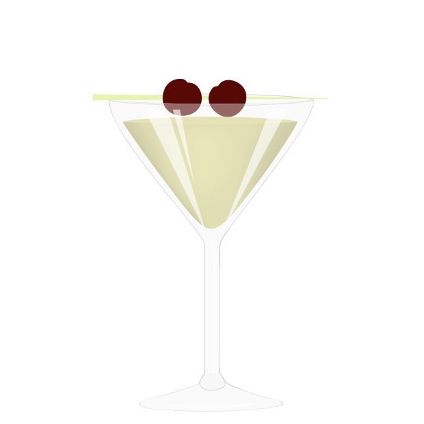
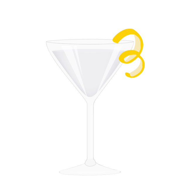
For my next sticker pack, I wanted to celebrate my appreciation for mixology with a set of finely made cocktail drawings. From the various glassware shapes, to the joy of drawing lemon twists, this set of stickers was pure fun from start to finish for me.
I’ve represented several classic cocktails, like the Old Fashioned, the Manhattan, and of course the Gin Martini. (I’ve even done a Vesper Martini variant, as a nod to the Daniel Craig fans.) I’ve also added some of my other favorites, like the Sidecar, the Tipperary, and The Last Word. I hope to add more in the future.
There’s beer of course, if cocktails aren’t your thing. Pilsner, IPA, Stout, Belgian Ale, Hefeweizen, and a nice Irish Red. And if wine is more your thing, we have that as well.
Finally, I round out the set with some accessories familiar to anyone who has started a home cocktail operation.
If you like crafting cocktails, or you just want to send a quick invitation to go out with friends for a few drinks, this set will suit you well.
I hope you enjoy the stickers, and I welcome your feedback. Have a favorite cocktail you’d like to see included? Drop me a line.
You can learn more about all the sticker projects I’ve worked on here.
Indies love to fall on their sword and die with dignity. I love Ned Stark[1] as much as the next guy, but in the end Varys is right: Ned died because he sucked at playing the game. Worse, he had an opportunity to help the realm, but instead his pride got in the way, and Westeros ended up with Joffrey.
The latest controversy in the indie community is over Apple’s new App Store ad system. Is it or is it not ethical to bid on keywords that are your competitor’s app name?
Why is this a question? Of course it’s ethical.
I have a timer app called Fin. If some other timer app developer bids on fin as a keyword, they may show up ahead of me in an ad placed just above mine when a user searches for “fin.”[2]
The Ned Stark argument goes that since the customer was searching for my app by name, I deserve that sale. I did whatever work I did to get my name out there enough for someone to search for me, so that customer is mine by right.
Sorry. Doesn’t work that way.
The ad placed above me is a competing app. One of three things will happen when potential customers see it:
They will ignore the ad, as many people have been trained to do.
They will look at the ad, investigate the other app, then find that they want my app after all, because that’s the one they heard was best.
They will look at the competing app, decide it’s better, and buy it instead of mine.
In two out of three of these cases, I get the sale I was going to get, anyway. In the third case, I lost the sale because my app doesn’t suit the customer as well as my competitor’s does. In the end, you know who wins? The customer.
Aren’t we supposed to be all about what’s best for the customer?
Now, if Apple’s ads allowed us to spread lies about our competitor’s apps, that would be a different story. If I named my app something confusingly similar to my competition in order to fool someone into thinking they were buying the other product, that’s completely unethical. But these ads are simply giving customers more information. Customers deserve to make the most informed decision possible. They deserve to know your app exists, and that it might actually be better for them.
If I were opening a hamburger restaurant in my town, you’d better believe I’d be placing billboards in the vicinity of every McDonald’s, letting those potential customers know there are better burgers a few blocks away. If not, I’m passing on a prime opportunity to reach my target audience.
If you know where your audience is gathering, and you aren’t willing to meet them there to pitch your product, you don’t belong in business.
Stop playing the game with one hand tied behind your back. Stop thinking that you can somehow make the world a better place by playing by different rules than your competitors. You aren’t making the world better. You’re leaving us in the hands of Joffrey.
Full credit goes to Jared Sinclair for this perfect comparison, via Twitter. ↩
Never mind that an actual search for “fin” gets you a thousand games before my app comes up. Consider this a hypothetical example where Apple’s search actually works, okay? ↩
Sitting in a hotel room, watching the WWDC keynote address with some friends this past June, Curtis Herbert commented that “Stickers will be huge” no matter how much developers make fun of the whole concept. I remember thinking, of course they would be. It didn’t even occur to me to make fun of the concept. There was no question stickers would be immensely popular. But there was no way I was going to use them.
I’m the guy who doesn’t even use emoji. What chance was there that I’d want to do the sticker thing?
Shortly after the announcement, I started drawing some guitars and basses in Illustrator. I’ve always enjoyed drawing musical instruments, and guitars in particular. They are beautiful objects, and they are relatively easy to draw, if you are comfortable with a bezier tool.
Once I got a few made, I thought, heck, why not do a whole set and release them as a sticker pack? I still wasn’t going to use them, but I’m sure other people would like to.
After all, stickers are one type of app where I have a serious advantage over most of my developer friends. While I may not be nearly as crafty with code, I can draw in Illustrator.
So I spent some spare time throughout the summer building out various guitar models.[1] It was a blast. I figured I could get a set done by late summer when iOS 10 would be released. I didn’t even bother opening Xcode, as I had watched the presentation on setting up a sticker pack, and I knew that part would be a one-day project, at most. Even if I chose to add some interaction elements.
And indeed it was. Creating an iMessage app could not be easier from a developer’s perspective. Of course, you need original artwork. So that’s where I spent the bulk of my time.
All the while, I kept thinking these stickers would be cool for others, but that I’d probably never use them myself.
Then a short while back I got a message from John Voorhees over at MacStories. He had been paying attention to my progress on the sticker pack and wanted to know if there were a beta available on TestFlight.[2] Beta? That hadn’t even occurred to me.
When a journalist asks to give your next product a test drive, you say YES. So I finished up the sticker images, watched the demo again from WWDC to review how custom interactions were done, (because I wanted to add the option to make the instruments left-handed) then built the iMessage extension in a few hours. I tossed a build up on TestFlight and invited some people to join.
The response was great. A lot of people seemed interested in trying out the stickers. Great. I fired up my phone and started playing around with the stickers myself. As I sent them to myself and to the people on my beta, something clicked. This was pretty cool. I could actually see myself using stickers in my iMessages.
Holy crap. I actually understand the appeal of something popular.
I can’t wait to see some of the other packs of stickers people have built. I have a feeling I will become a collector. And I want to make more stickers soon. I’ve done a set for Curtis’ Slopes app, and I hope to do a lot more for clients.
Contact me if you are interested in getting a set made. The fact that sticker packs send links to people when they don’t have your pack installed is bound to make stickers an incredible catalyst for word-of-mouth downloads.
Meanwhile, The Leo Collection is available to buy now. I encourage you to check it out.
Last time I left off at the artist listing screen. Today, I want to dig into the individual artist view, album view, and the now playing screen.
One of the reasons I chose to give Music another try in iOS 10 is that Apple has finally given us a proper artist album listing, with albums that drill down into their own screens. This means we can finally choose an artist, then play a single album without it continuing on to the next album. Sounds like a small thing, but I dropped Music altogether years ago for that one reason alone.
Best iPod we’ve ever made, my ass.
Unfortunately, unlike iTunes on the Mac and Windows, Music on iOS still only sorts albums by name, giving us no option to sort them by date instead.
This is one of those head slap moments that makes you wonder if anyone at Apple has ever been a serious music collector. As far as I’m concerned, Apple cannot claim that it loves music ever again until it gives us the option to sort albums by date. No self-respecting music geek sorts albums by name. I don’t care if you hide the option in the Settings app, just give me the option for date, you wankers.[1]
Sorting issues aside, I like most everything else about the Artist page in Music. Album art is square and large, as it should be. There’s a quick option to shuffle all albums, in case that’s your thing. And, as I said before, choosing an album gives you a separate view with just that album’s tracks.
At the bottom of the artist page there’s also a new link “See more by…” that takes you to that artist’s other music on Apple Music. I’m not an Apple Music subscriber, but I guess it’s okay to be able to see what tracks are available without having to bounce into the iTunes app.[2] Unfortunately, any links inside here only give you the option of subscribing to Apple Music. You can’t link over to iTunes to buy any tracks you find. You can’t even preview tracks to see if they’re worth subscribing to get. It’s subscribe, or go screw yourself.
I’m sure the artists love that.
What’s so hard about offering a link, even via 3D Touch, that takes you to the iTunes store to buy a track?
Buy a track? Come on, Joe. Who buys tracks nowadays?
Oh yeah, that’s right. People who LOVE MUSIC.
Once you choose an album, you get the track listing, as you’d expect. Shuffle is right up there at the top again. Okay. Not something I ever use, but I guess a lot of people like shuffle. (More on this in a moment.)
Choose a track, and it starts playing immediately. At the bottom of the screen, just above the tab bar, you get a new bar for now playing, which stays there no matter where you go in the app. I like this a lot. I always hated how hard it was to get to the now playing screen on my old iPod and on Apple TV. This makes it one tap away at all times, which is brilliant. Music also doesn’t assume that once I’ve chosen a track I want the entire screen to be filled with now playing. This is also a good design choice. Once my music is running, I may want to select something else to play next, or keep reading the rest of the track listing, or just go exploring more through my catalog, etc.
At the bottom of the album page, there’s “More by…” again, only this time with albums and images listed. There’s also a “You Might Also Like” section with music from similar artists. Okay, now I’m getting annoyed, Apple. I switched Apple Music off in Settings. I’m clearly not interested in joining Apple Music. Fuck off , already.
Again, every link in these two bottom sections I didn’t ask for give me no option to even preview tracks from these suggested artists. Just subscribe now.
The now playing toolbar has convenient buttons for pausing and skipping the current track. Another great design decision. One-tap access to pausing is essential, and sometimes you really do need to skip that one track you hate immediately.
Tap into the full-screen now playing view, and you are treated with nice big album art and some more controls in an overlay “card” type view that is reminiscent of Palm’s WebOS. I mostly like what they’ve done with this screen. But there are a few odd choices here.
The big one that others have mentioned before: Where are the shuffle and repeat buttons? For all the emphasis on shuffle being at the top of the past few screens in a row, I get to now playing, and shuffle has disappeared. Turns out, the now playing view is scrollable, and shuffle and repeat are just below the “fold.” Why? No reason I can discern. There’s plenty of room under the volume slider for more than two buttons.
Also, if you’re going to make this screen a scroll view, some indication that it can be scrolled might be a good idea. I know several people who had no idea that they can scroll this view at all. And that’s a shame, because what’s down below the fold is actually quite nice: an Up Next listing, where you can manually reorder or remove tracks from the upcoming cue.
Up Next is a pretty powerful thing. Setting up a quick one-off track listing for a party, for instance, becomes quite easy. I never use playlists, but I often will select a number of albums to listen to in a row when I’m in a certain mood, or I have people over the house, or when I’m on a road trip, etc. The “Play Next” and “Play Later” options on albums and tracks make setting up a quick cue super flexible and easy.
Overall, I actually like Music in iOS 10. The app is far from perfect, and I really want the heavy-handed Apple Music sales pitch to go away, but otherwise, for my listening style, this app is greatly improved over iOS 9 and earlier versions of Music.
And, lo and behold, since I’ve started adding tracks back to my iPhone, I have yet to experience the old issues I was having with files disappearing, doubling of tracks, tracks that simply won’t play, etc. Maybe the file system bugs I was experiencing are gone? I may just upgrade to a 128GB or even 256GB iPhone in a few weeks. I’d love to retire my old iPod again for good.
The improvements in watchOS 3 over watchOS 2 are still, to me, the most exciting thing happening with Apple this summer. I would have skipped the iOS 10 beta altogether if not for the fact that I simply couldn’t wait to get watchOS 3 on my Apple Watch. The difference in day-to-day practice is staggering.
That doesn’t mean that watchOS 3 is perfect, of course. There are still two little things bugging me that I wish Apple would address.
First, the Activity rings. It’s great that there are a few Activity-centered faces on the watch now. I use both the analog and digital versions quite a bit. But neither face, and none of the complications for Activity give me the one piece of information I want most often: whether or not I’ve reached my stand goal for the current hour.
I can read how many hours I’ve stood quite easily, even in the complications. Divide a circle in 12 pieces, and it becomes a breeze to see which number of hours you have currently fulfilled. But there’s no way to know whether one of those hours is the current hour. Once I get to the 50-minute mark, of course, I will get a notification if I have not yet stood. But what about at 38 minutes? The only way to find out is to launch Activity, then scroll down all the way to the chart that shows the hours of the day listed out one by one. I do this several times a day, and it’s annoying. Seems to me that this information could easily be provided in the complication, on the Activity watch face, or at the very least on the initial view of the Activity app.
Second, the charging screen. When my Apple Watch is in its charging stand, and I tap it to light up the screen, there are only three possibilities for what I currently want to know:
Is it actually charging?
What time is it?
What’s the current charging percentage?
The first two are covered well. The lightning bolt icon at the top lets you know it’s charging, and the watch face gives you the time.
For the current charging percentage, however, it’s a different story. When you first connect it to the charger, you get that nice big circle showing the current percentage (which is also a more obvious indicator that charging is actually happening at the most important moment—when you first plug it in). But any time you tap the screen after that, there’s no way to see the current percentage on the screen. You need to type in your passcode, then swipe up to get your command center, where you can finally see the percentage.
Every iOS device gives you a nice big battery icon with the current charging percentage listed under it when it’s charging. Why not at least put the percentage next to the lightning bolt icon?
Even Nightstand mode, which I never use, doesn’t give you the percentage. Seems like a silly omission.