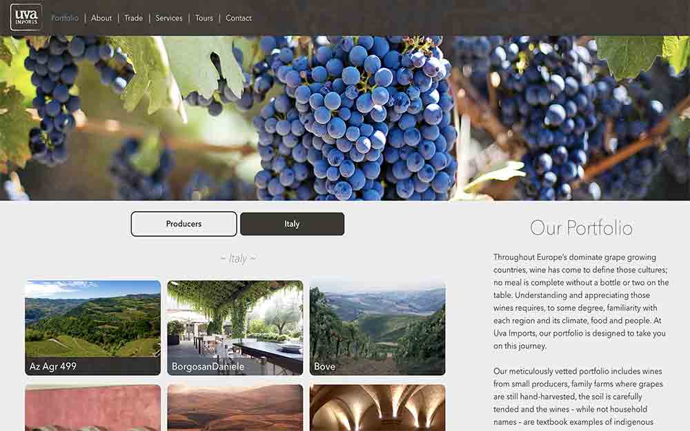
Uva Imports needed not just a visual update with a more modern, responsive design. It also needed a completely new back end that would allow them to maintain and edit their ever-changing portfolio of wines. We chose the excellent Perch CMS to serve up the data, which gave me the freedom to hand-code HTML and CSS as needed, while still providing an easy-to-edit environment. This meant the client would no longer be dependent on me (or any other web professional) to make simple changes as needed.
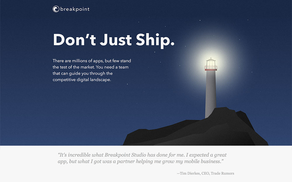
Breakpoint Studio was in need of more than just a web site. They were a new company establishing a new brand. In the app consulting world, there are many players, and Breakpoint needed to find a way to express what they where uniquely qualified to offer above and beyond the competition. Through extensive conversations, the theme that kept coming back was building success, not just applications. Thus, “Don't Just Ship” became the central theme that guided the design of the entire brand and site.
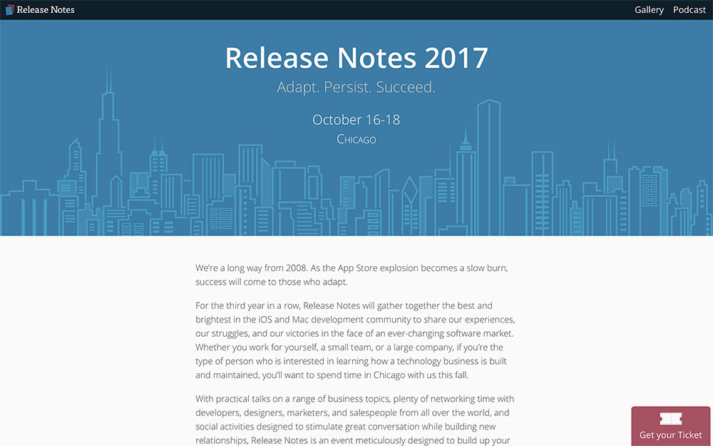
One of the challenges for Release Notes has been the dual role the site plays as the home of a popular podcast as well as a yearly conference. This year, I've helped guide a redesign of the conference page to help create more distinction between the two roles.
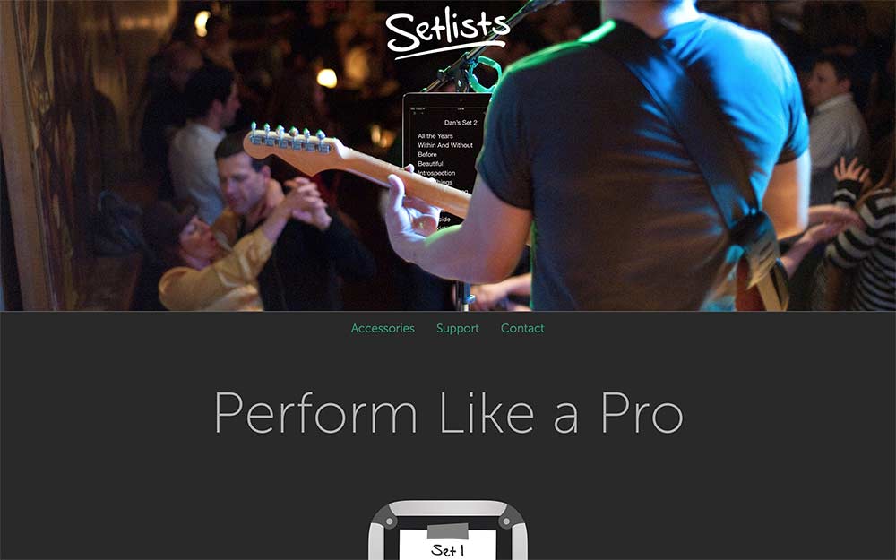
Bombing Brain's app Setlists is a professional tool for musicians. This site needed to convey all the benefits the app offers to a performing professional. Prosumer apps such as these need sites that highlight the most important features while also offering a full list of specs sought by careful researchers. The recommended hardware page also highlights some tools that can be combined with Setlists. This saves the customer time researching the best hardware choices, while also helping as a marketing tool for hardware partners.
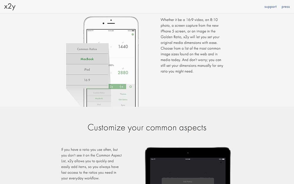
x2y is an app built for Mac and iOS as a personal project. For the web site, I wanted to build something clean and simple. Selling potential customers on the benefits of a utility like this is often effectively accomplished with a single, one-page scrolling design. Yet too few app creators spend the time making an effective site to sell their products.
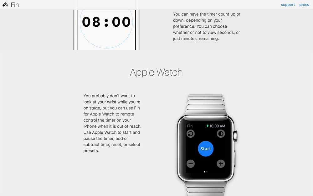
Fin is another personal app project of mine. My approach to the web site was similar to that of x2y, as it served a similar purpose. Sites such as these are incredibly effective at a minimal effort to design and implement.
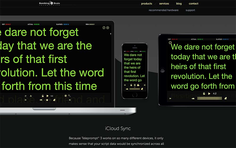
Bombing Brain Interactive creates professional applications for various multimedia professionals. They also offer consulting services. Their flagship product Teleprompt+ needed to be front and center on the site, while still offering information on the company's other products and services. The dark, sleek look matches the applications they build.